

Objective:
R.E.M.edy is a sleep app designed to help those looking to maintain healthy and consistent sleep schedules with its customizable schedule, sleep tracking abilities, and tips for better sleep practices. R.E.Medy needed a visual identity and layouts for each screen to make the app intuitive while remaining simple enough that it does not overstimulate the user before sleeping.
Methods:
Mind-mapping/Moodboard & Sketches
Flowchart/Wireframes
User Scenarios
Implementation/Mockups
Collaborators:
Thu Do, Kourtney Owens, Lily Giordano
Phase One: Ideation
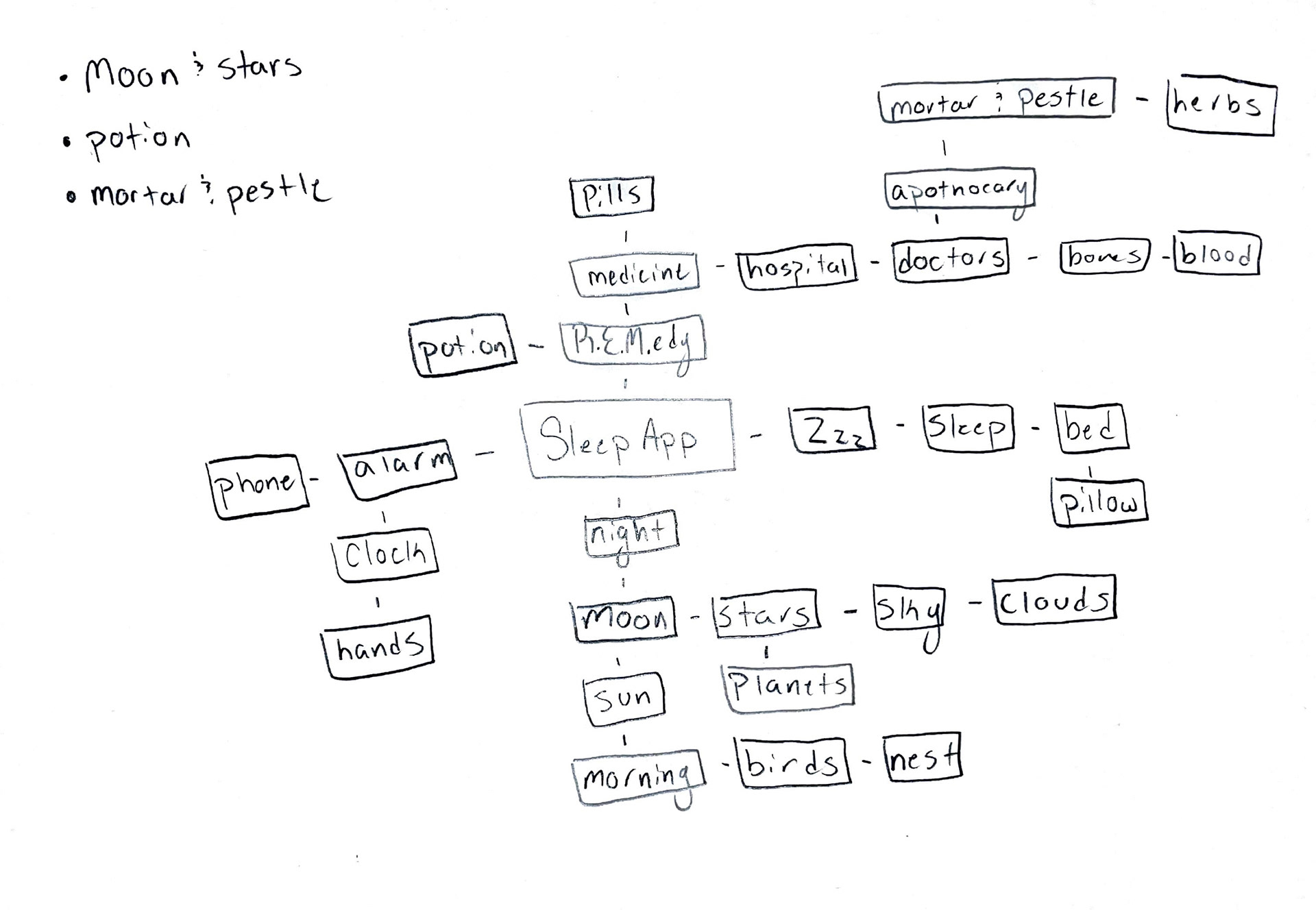
Brainstorming:
Starting with a mindmap and moodboard, ideas for the visual identity of the new app are generated. Three main concepts are chosen to be pushed into the next phase.
Pencil and Digital Sketches:
From the brainstorming exercises, logo sketches are made exploring each concept. The first interface sketches are also made to see how these concepts can be applied throughout the app. The strongest logo pencil sketches and interface sketches are then pushed further through digital iterations.
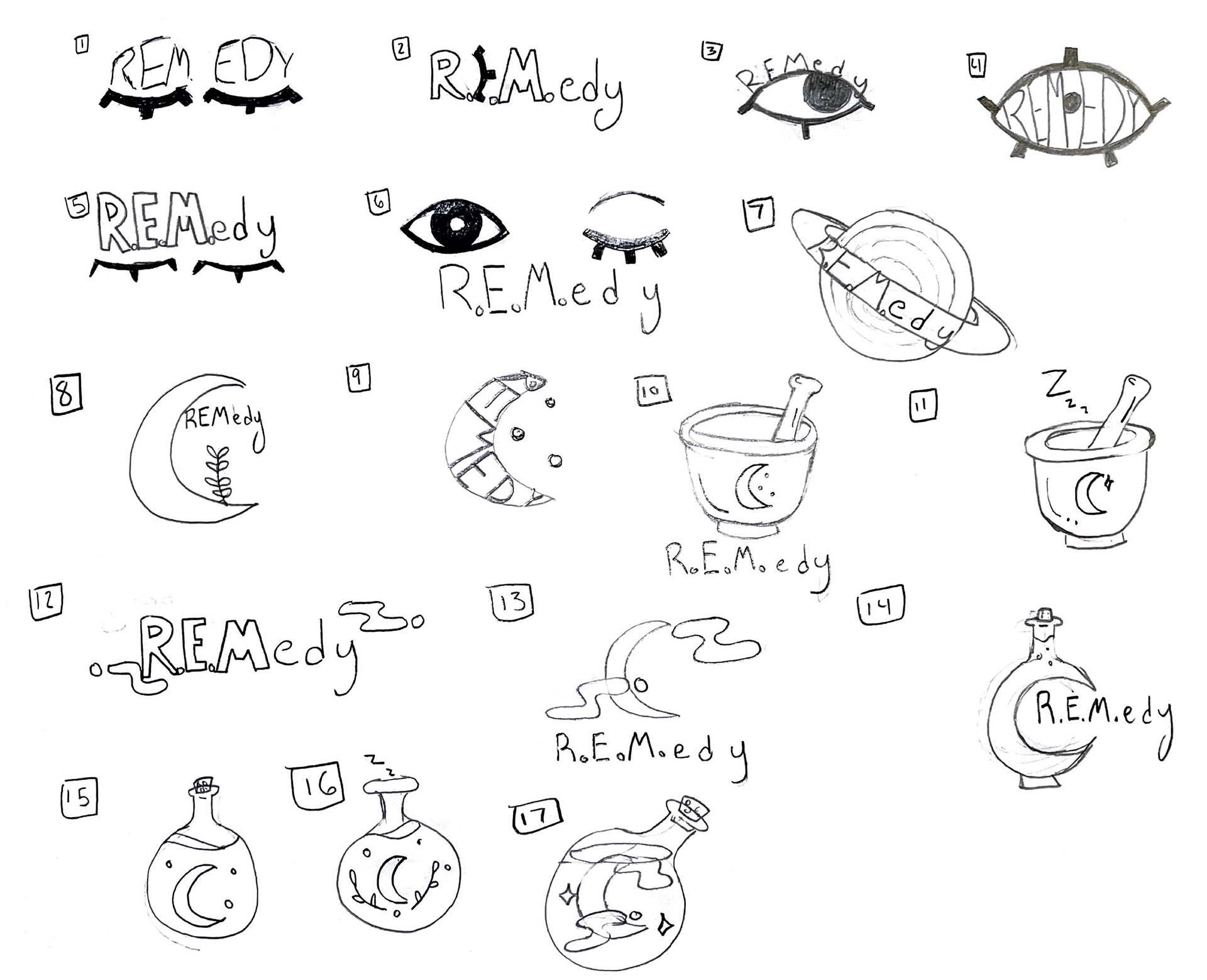
Logo sketches
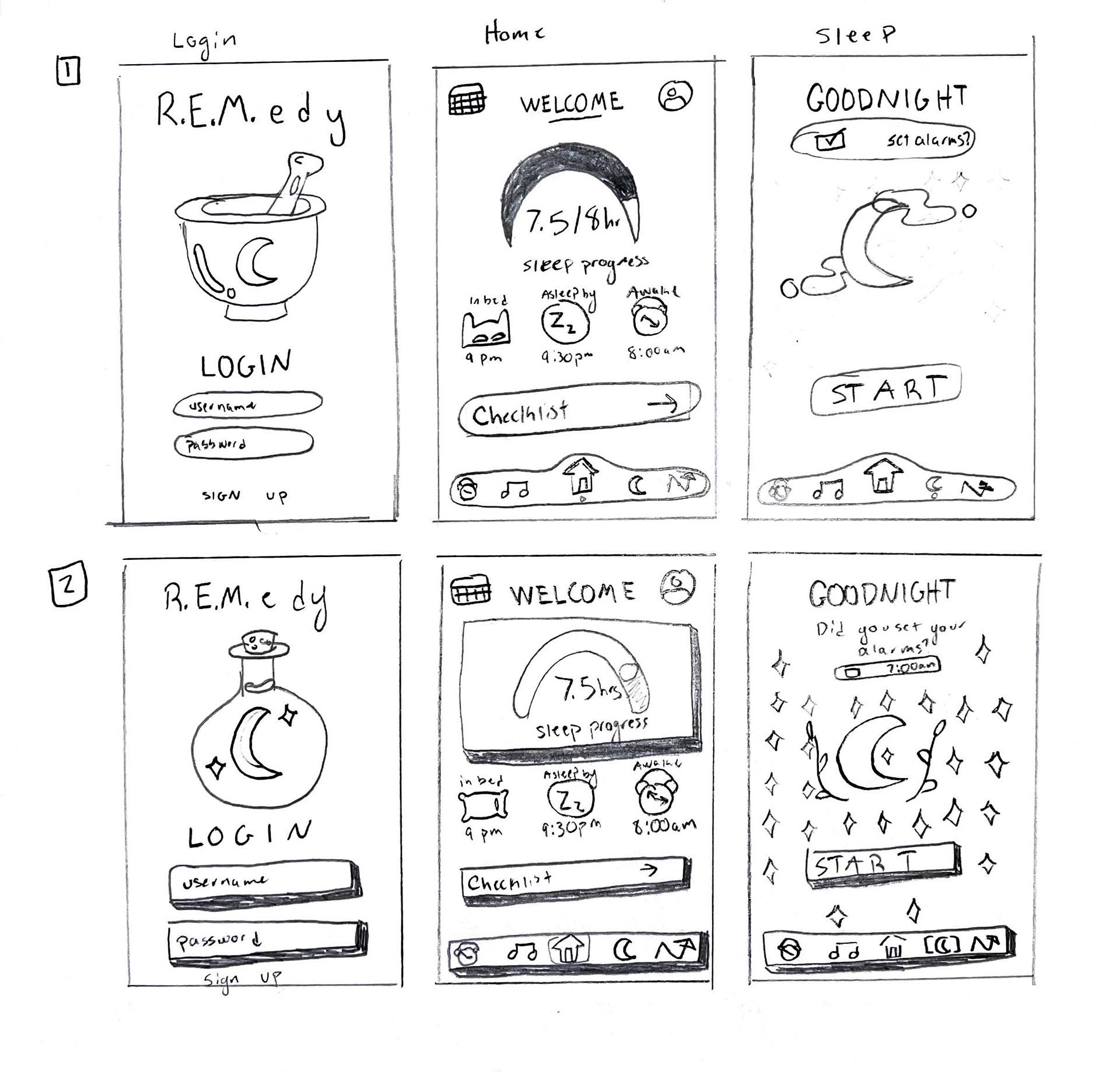
Interface sketches
Final Brand Elements:
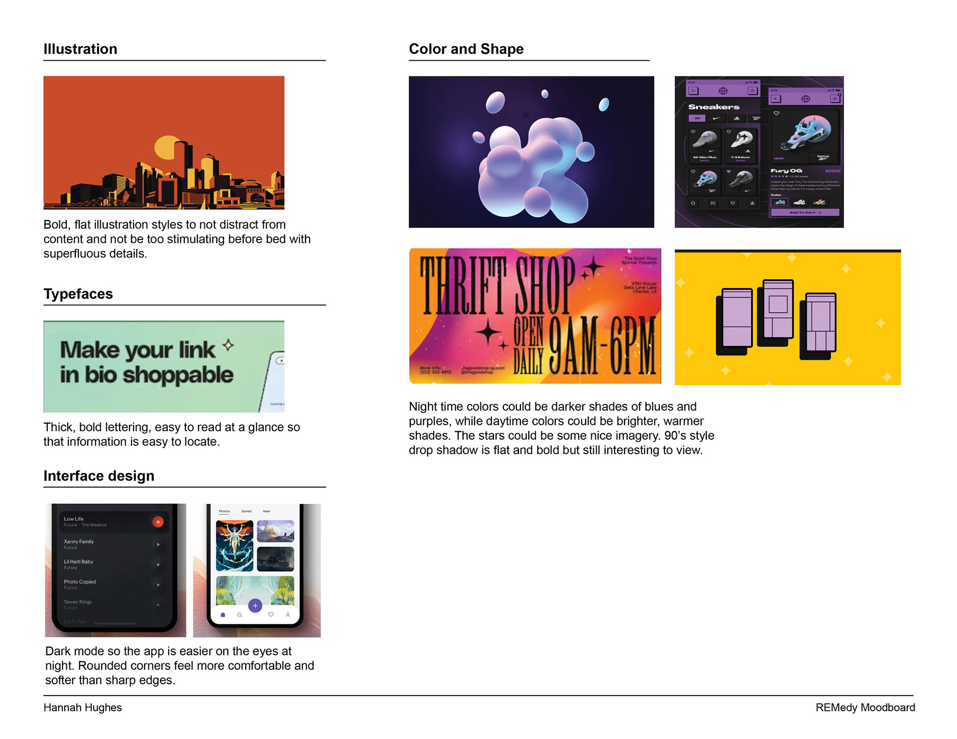
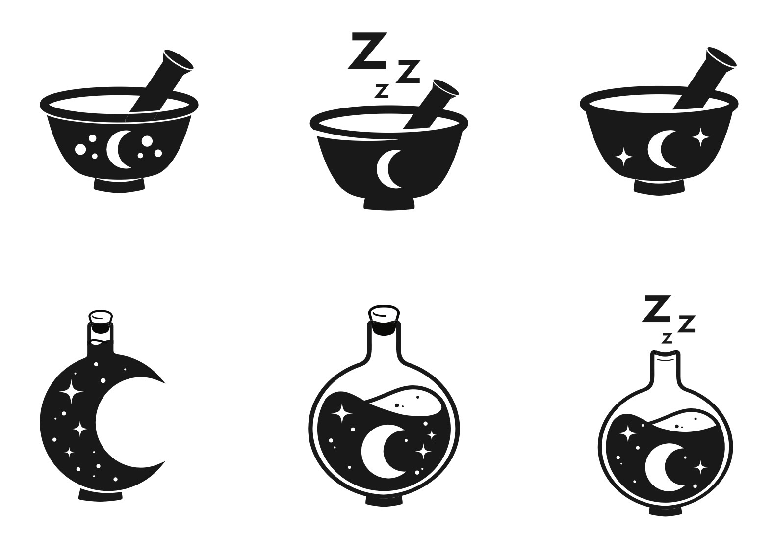
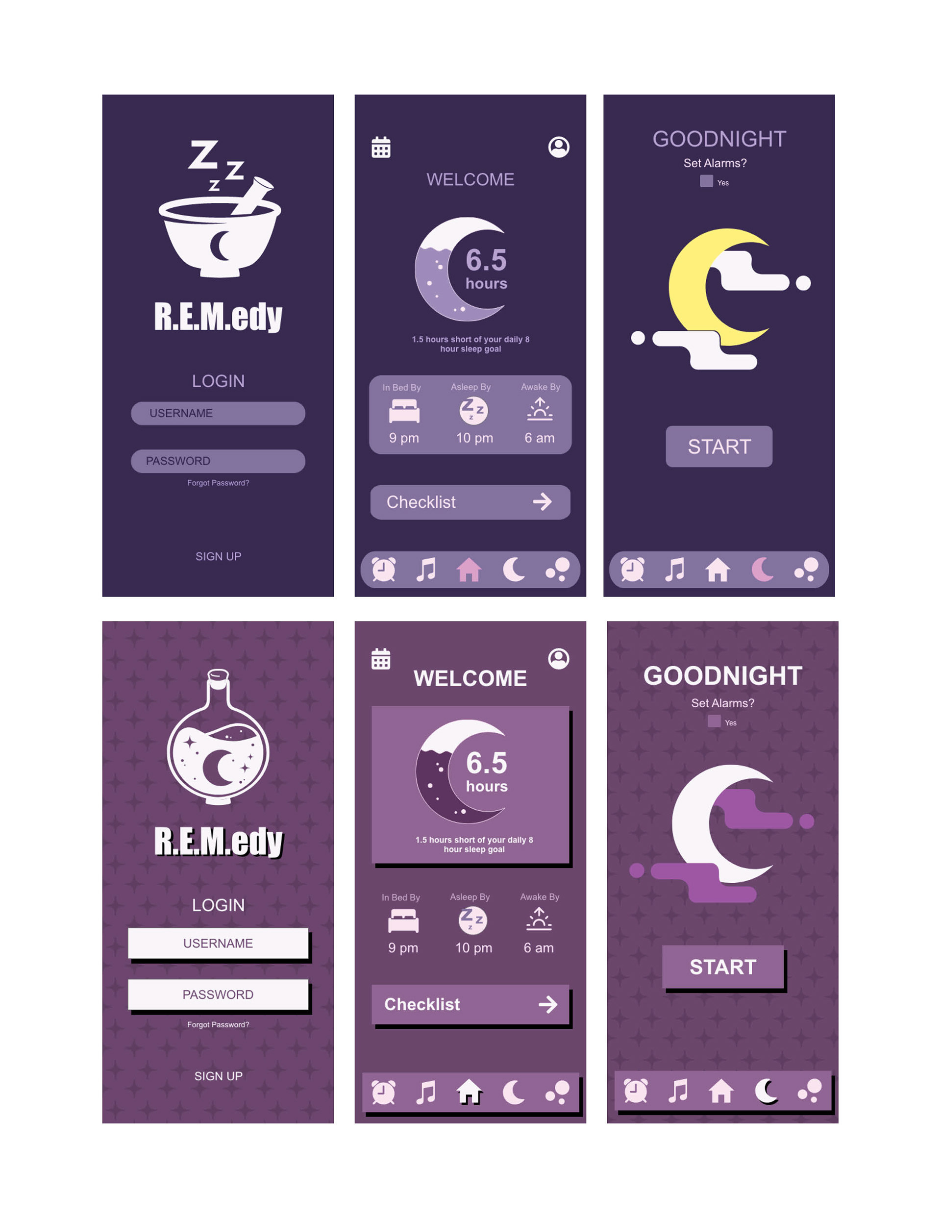
R.E.M.edy's logomark holds the night inside a sleep potion accompanied by a thick, bold typeface so that is easy to see quickly. The app's color palette consists of deep blues and purples to simulate the evening sky with pops of light pink and white for contrast and readability. The main font used throughout the app is SF Pro so that it is ready for Apple iPhone integration. Icons are made of bold shapes, so that they are easy to identify quickly when one is tired.

Phase Two: App Development
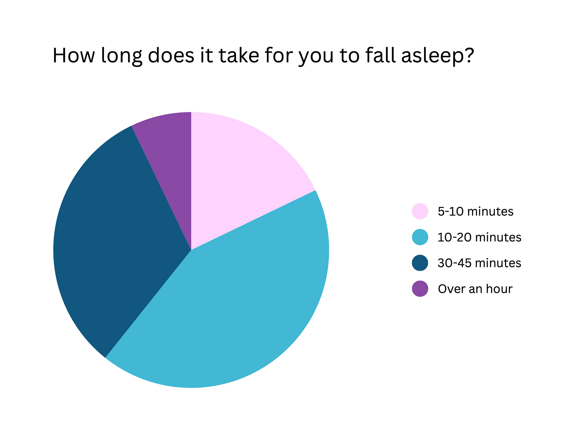
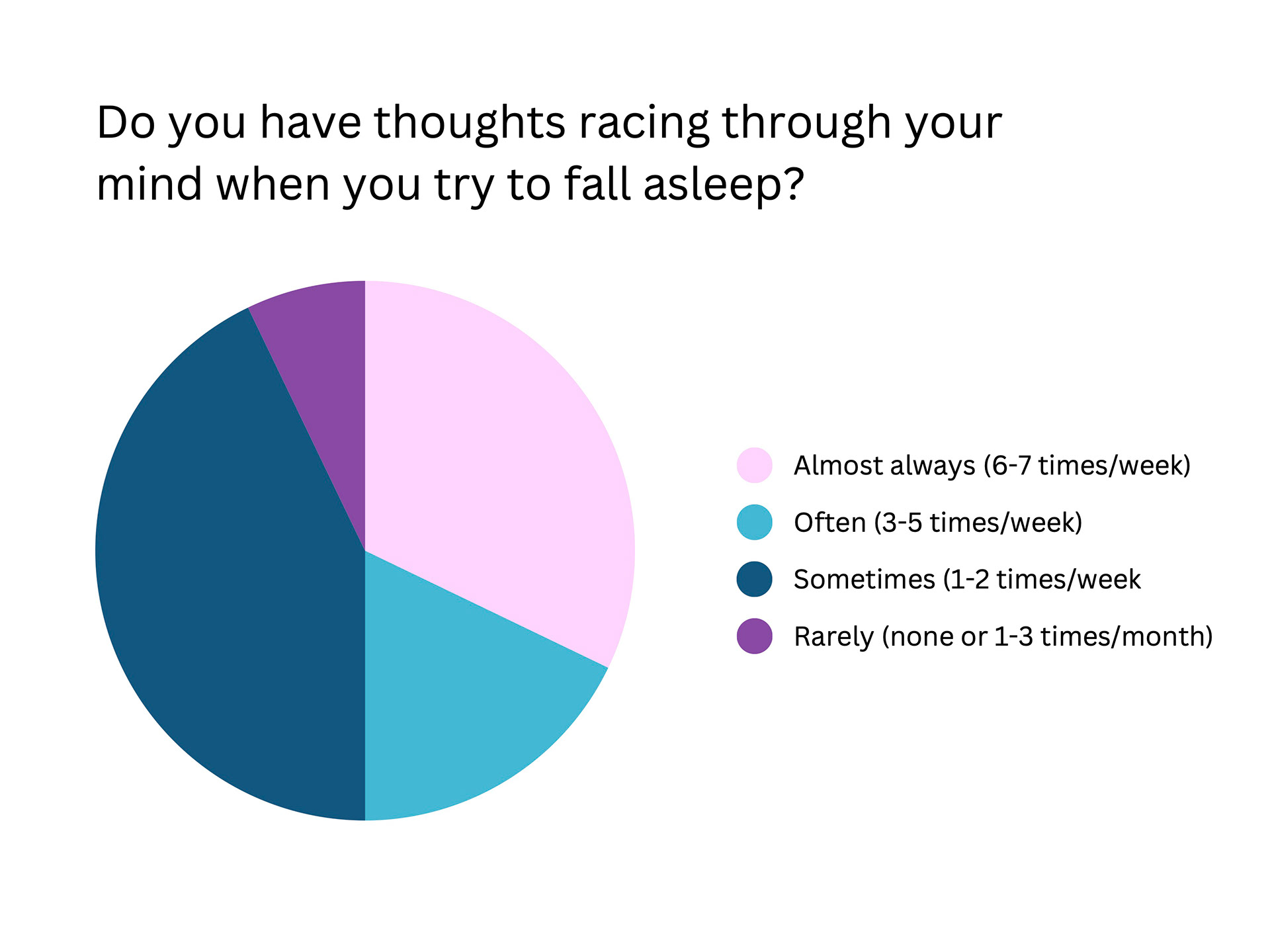
Research Survey:
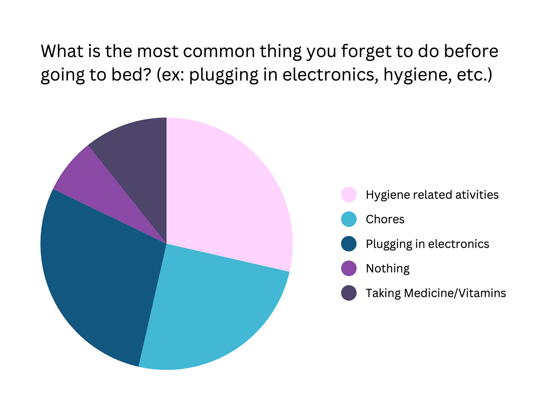
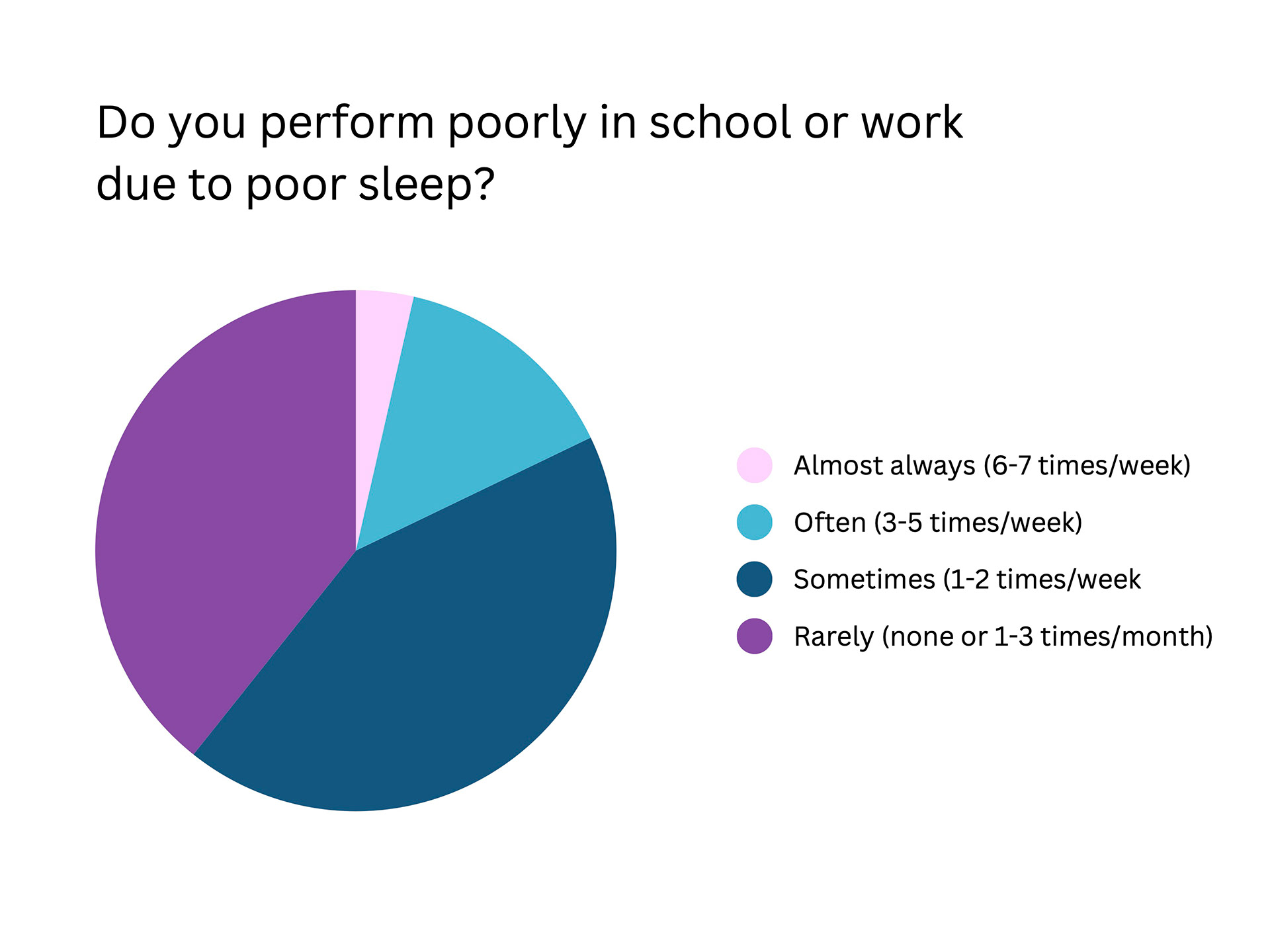
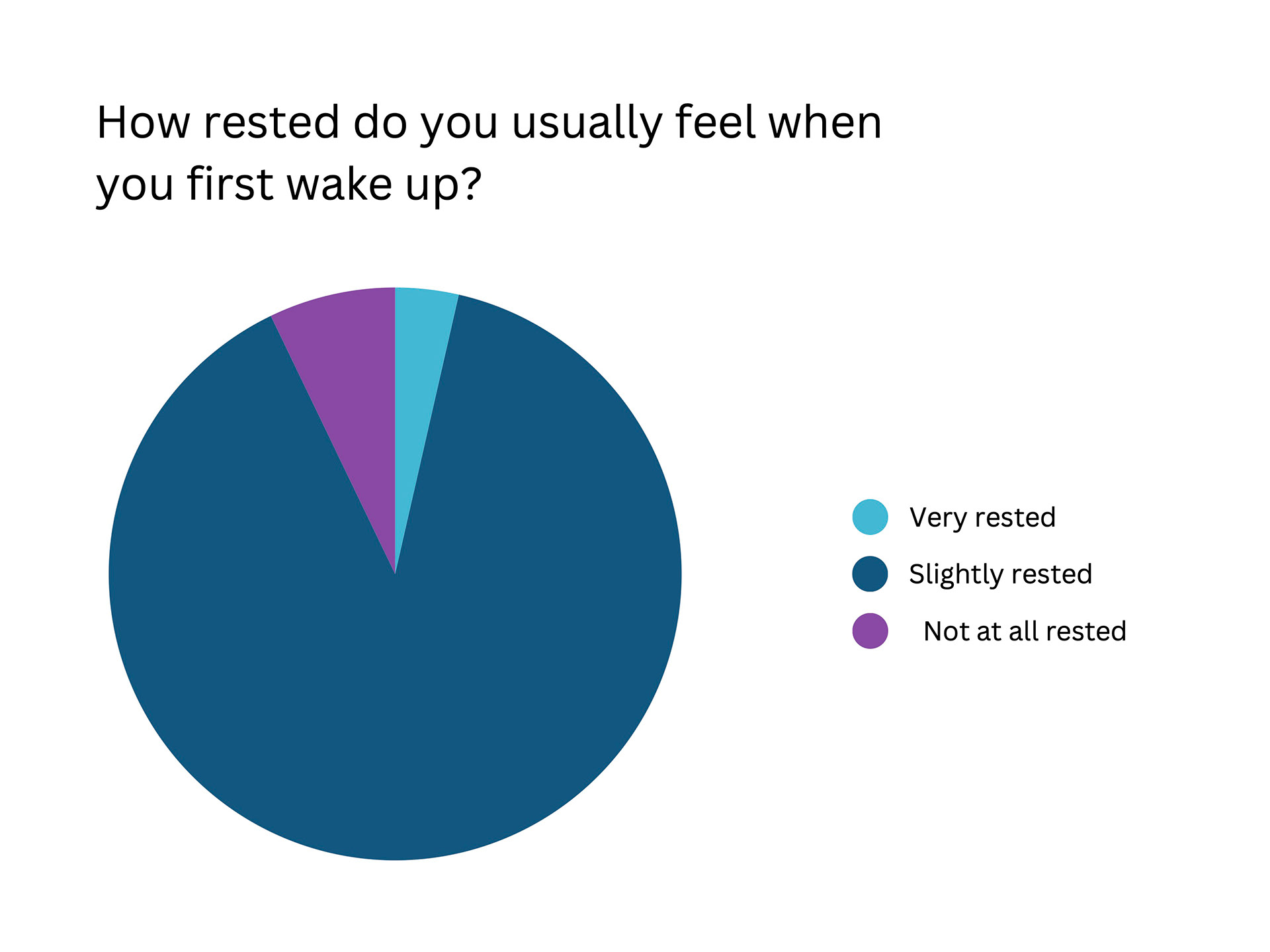
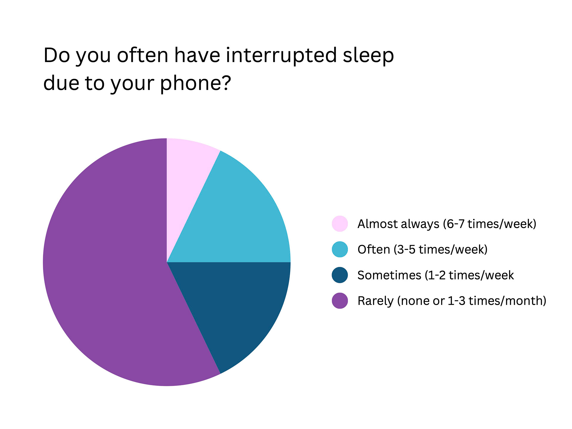
My team and I then got together to conduct a survey focusing on sleep struggles and other nightly habits to assist us in finalizing decision making on which features to showcase in the app. The results of the survey concluded that there was a need for a variety of sound options for users to play, which activities people needed to be reminded of doing before bed, a need for a phone silencing feature, and an overall need for better sleep quality.


App Navigation: Flowchart and Sketches
With the results of the survey in mind, my team and I concluded that the most important features to highlight were the alarms, sound library, patterns page, sleep timer with background AI tracking methods, and a home page that allows for quick sleep summary and nightly checklist. Next, we began to mold the flow of information through a flowchart and sketches of interface navigation.


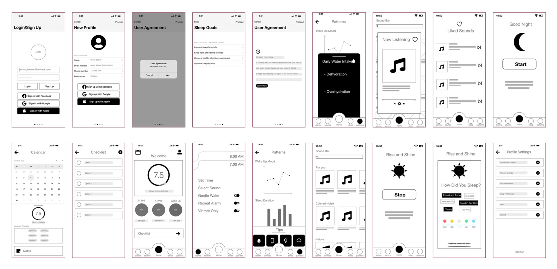
Wireframes:
My team then constructed wireframes for each page within the app to use as a starting point for the app's design. The focus was on the main functions and pages of the app.
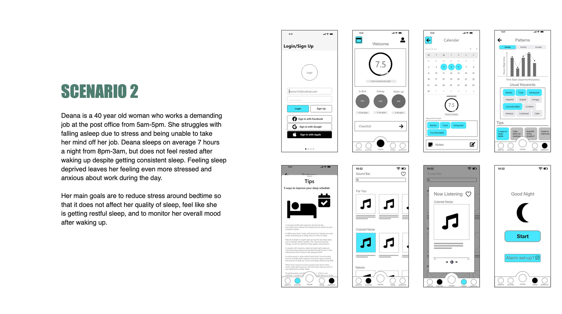
User Persona Scenarios:
After construction of the wireframes, I then prepared user personas to simulate different scenarios of how the app would be navigated by different users based on preferences and goals.


Phase Three: Implementation
Solution:
Branching off concepts of sleep as a part of healing and maintaining a healthy lifestyle, the logomark for R.E.M.edy plays on a health potion containing the night sky. Using a dark background for the app is much easier on the eyes in comparison to a white screen when in a dark room, since most of the users are likely to use the app right before bed. Using bold graphics and icons make information easier to locate quickly, especially in sleepy state.

Login, Home, and Sleep screens
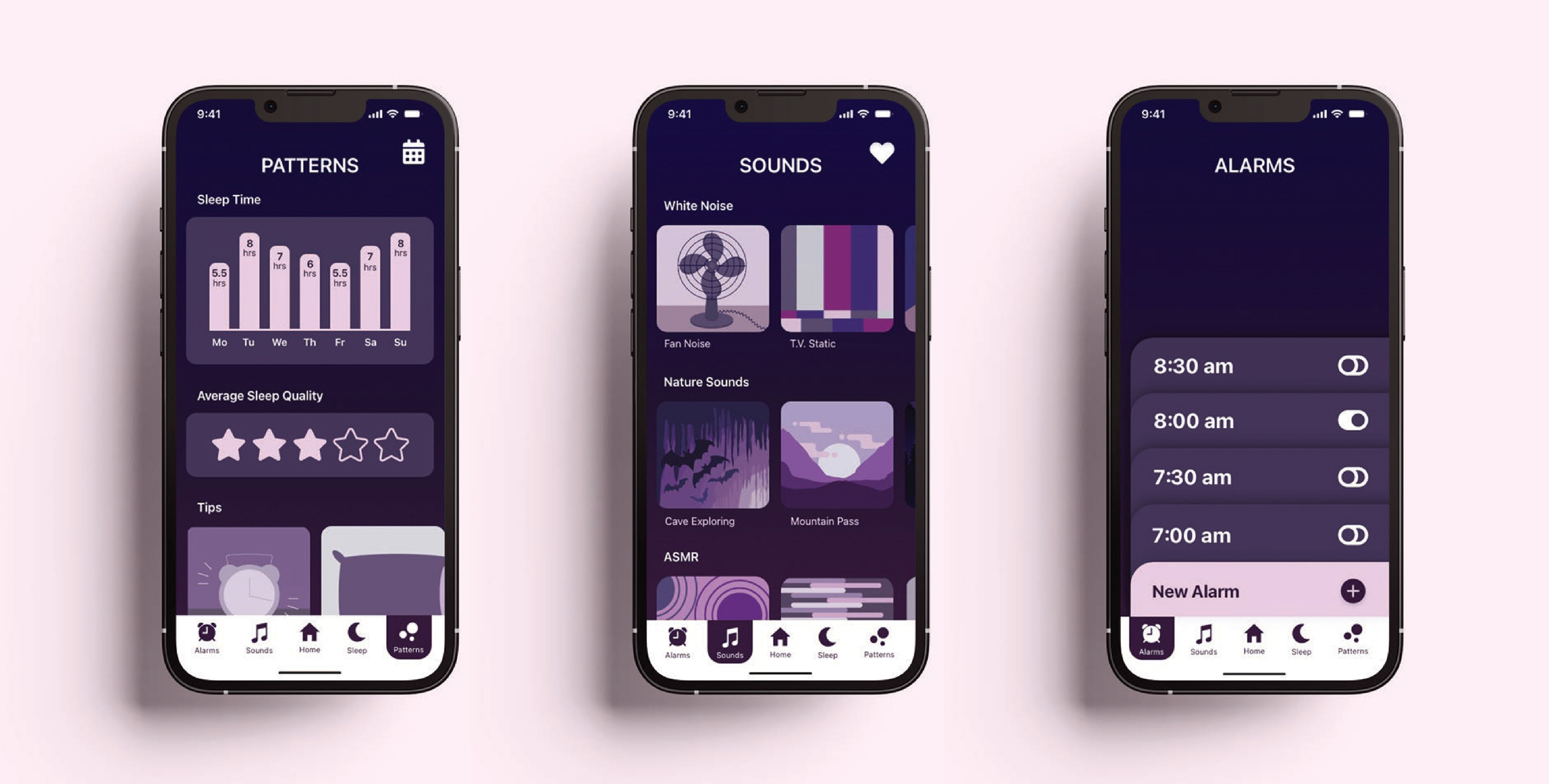
Patterns, Sounds, and Alarms screens
Navigation:
This video demonstrates the basic navigation through the app, taking a quick journey through each page.