
Me!
Hi, hello, and welcome! I’m Hannah, a PNW based designer and illustrator full of wonder and passion for all things whimsy. Freshly graduated from Oregon State University with my BFA in Graphic Design and a minor in Studio Art, I am ready to put my problem-solving skills and creativity to the test.
My love affair with design started way back in 2015, when I first laid my hands on Adobe Illustrator in a sophomore level high school graphic design class. Since then I have created branding for small businesses, built custom packaging, dabbled in printed materials, and funneled my passions into side projects and schoolwork. These experiences have allowed me to hone my design prowess while forming some amazing bonds with clients, peers, and professors.
On a more personal level, I consider myself, above all else, as a creative. You will often find me sketching out ideas, playing with my camera, carving linoleum for relief prints, and writing a long planned out story. Though these activities are my hobbies, they have also allowed me to expend my creativity into different mediums which has contributed to my design success. If you are interested in my work, let me build you a brand identity, design your printed materials, or make you a custom illustration!
Let's create something awesome together!
Shining Light On My Personal Brand Identity
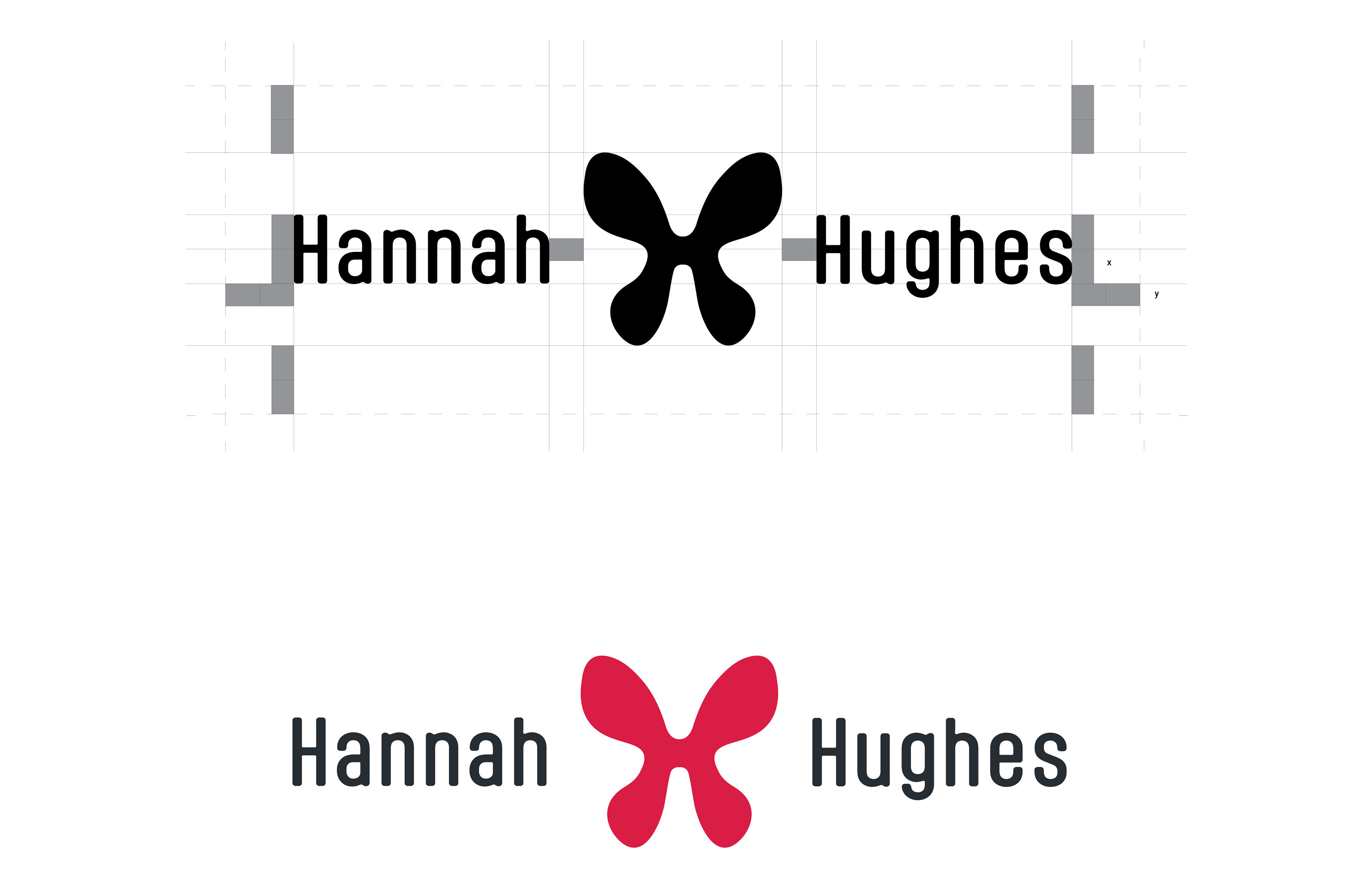
The Logo & Signature:
The logomark is a combination of a butterfly with spread wings and an uppercase 'H'. During the ideation process, I landed on a concept of ink splotches as a theme to tie my illustration abilities into my brand as a designer. The butterfly aspect is to symbolize transformation due to the constant changing and adapting nature of design. The signature uses a slightly modified, soft-edged sans serif that compliments the go-with-flow personality of the logomark.
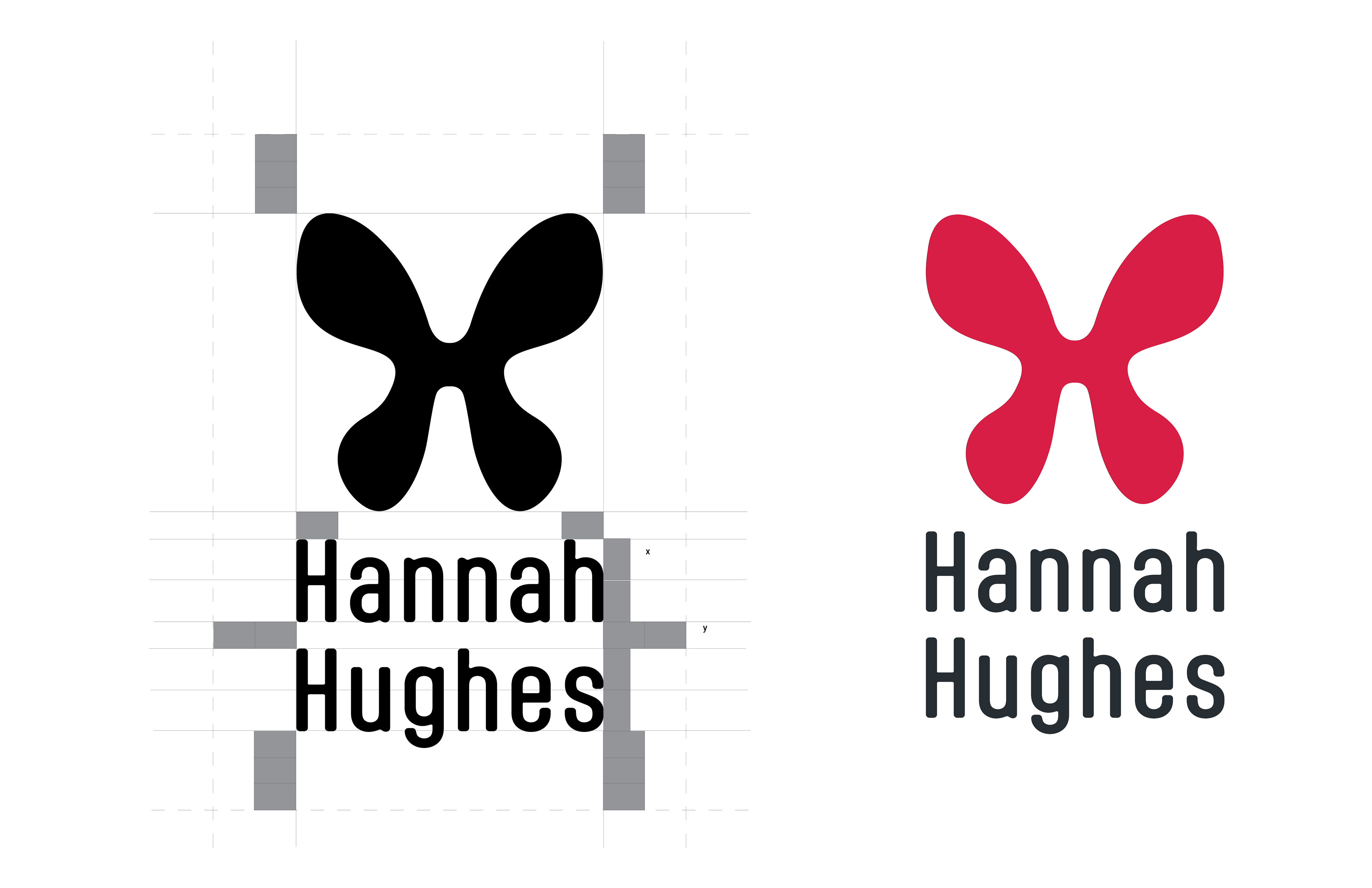
Vertical Logo + Signature
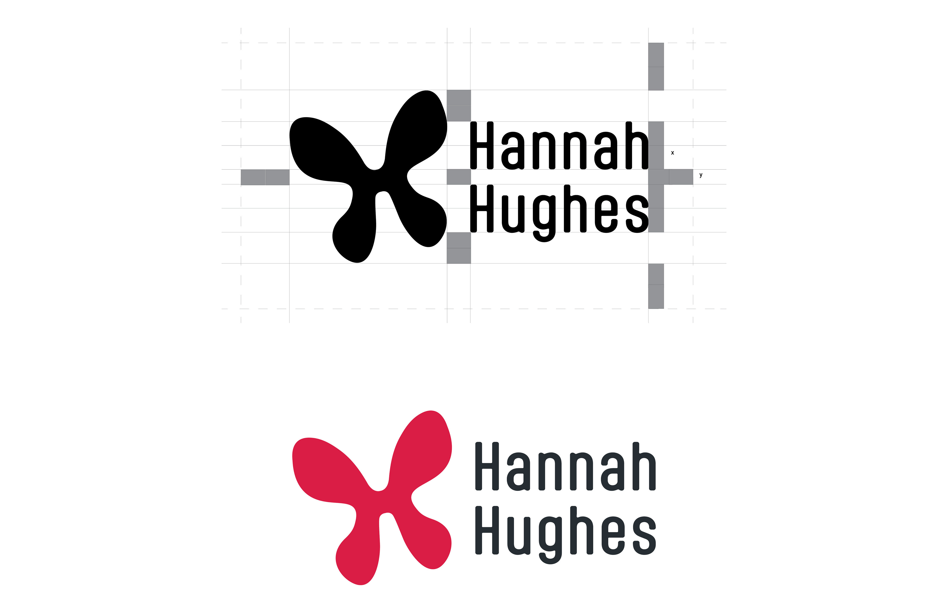
Horizontal Logo + Signature
Alternative X-Long Logo + Signature
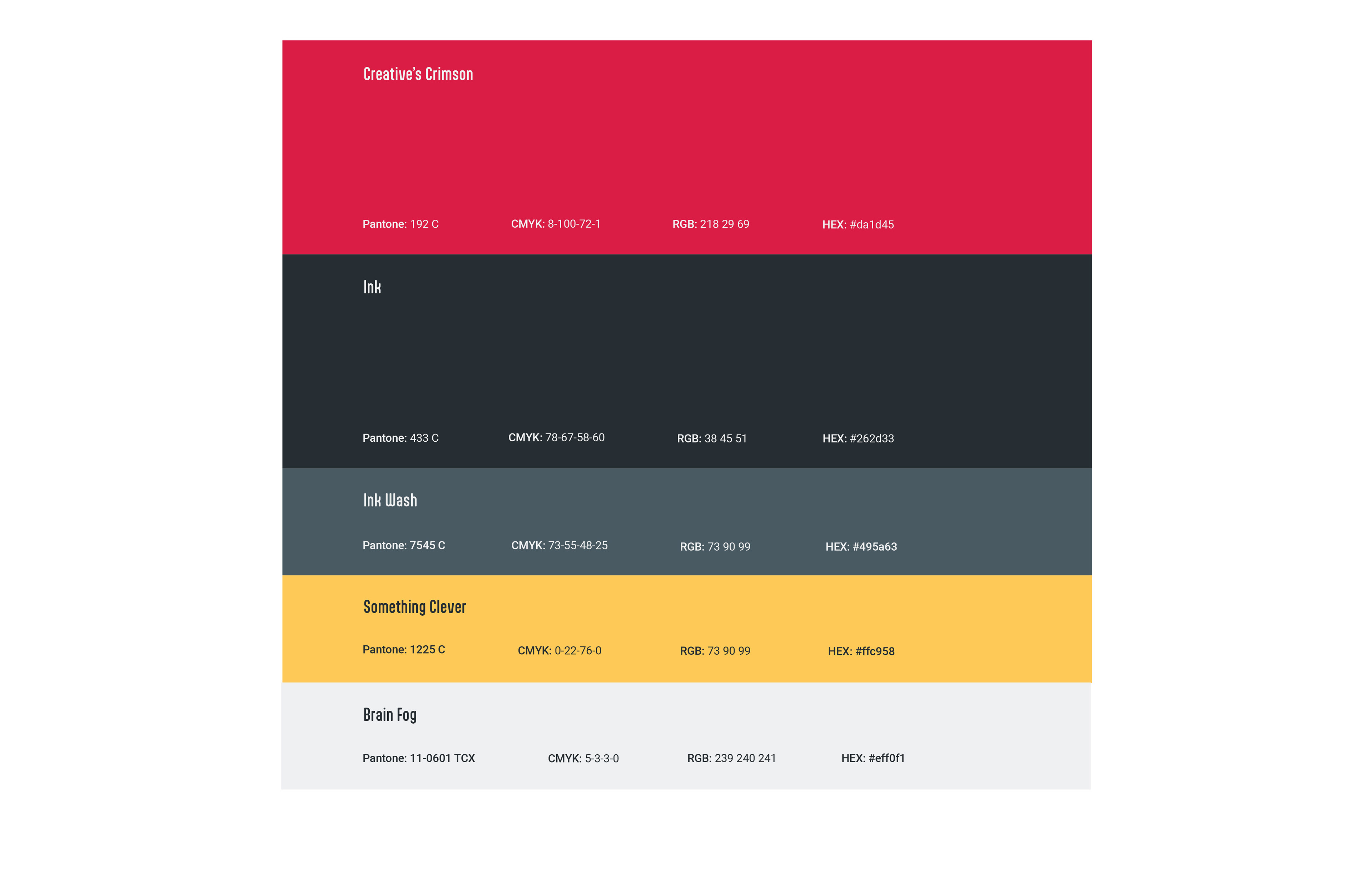
The Color Palette:
Inspired by my most used colors in illustration, the brand’s color palette uses a cool grayscale palette with pops of bright, eye-catching colors for simplicity, accessibility, and a dash of intrigue.
Typography:
The condensed sans-serif Aptly provides just enough juxtaposition to the organic elements of the brand while still remaining soft with its round edges. Aptly acts as the header and display type. Roboto, a more simple and easy to read sans-serif complimenting the display type, acts as the body copy and the subheader font. And GoodDog New? Well it’s just used for fun.

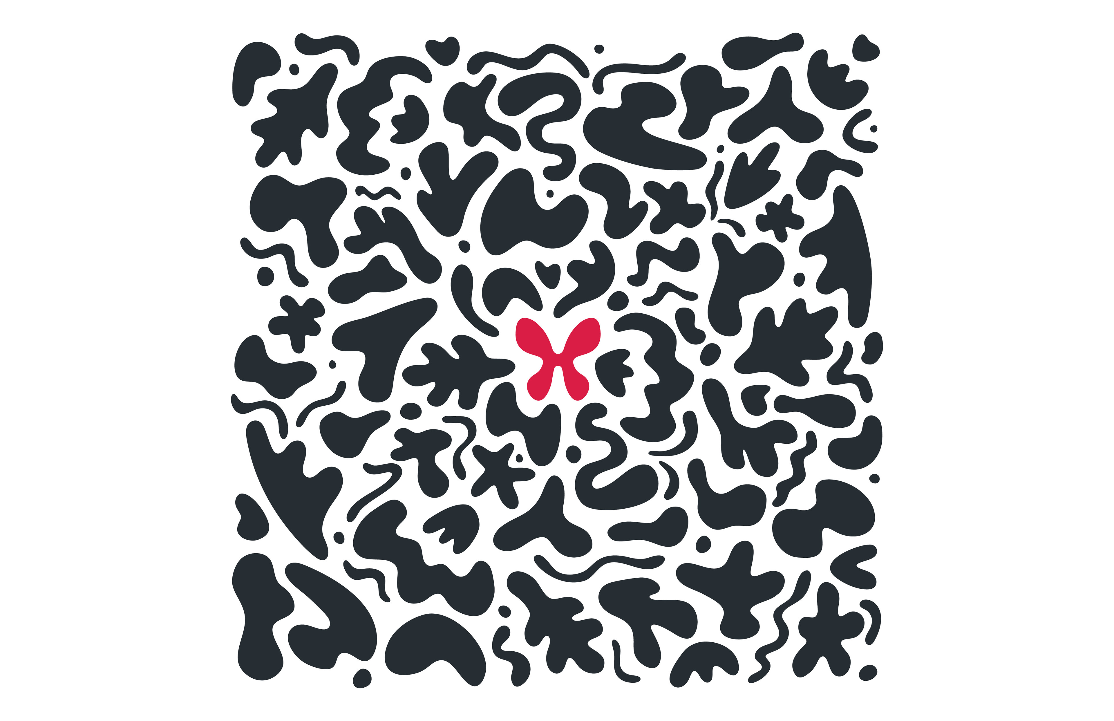
Brand Pattern:
Artist by nature, designer through discipline, the brand pattern is a hand drawn array of organic shapes ranging from abstracted natural forms and shapes resembling ink splotches that don’t quite wash out of my jeans. Centering the pattern is the bright logomark to add a point of interest and mark my grounds. The pattern should always be in the primary color scheme on a light background. Elements can be taken out and used individually or rearranged for different formats.
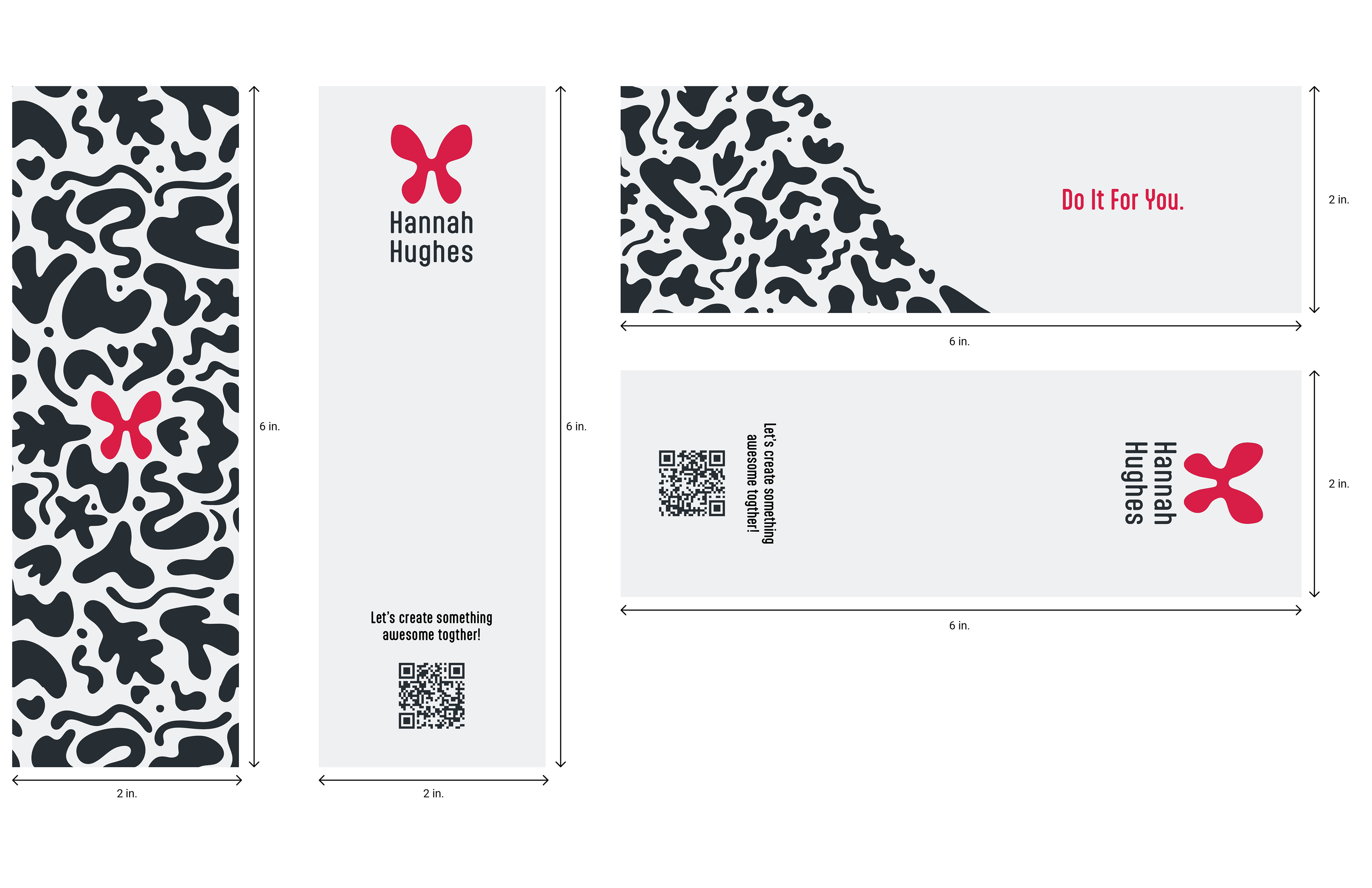
Stationary & Fun Extras:
Applying the brand to stationary like my cover letters and business cards allows my materials to easily stand out in the sea of designers and allows for people to quickly identify me. The brand elements are also applied to several fun promotional giveaway items I like to hand out whenever my profession comes up at parties or in the wild.
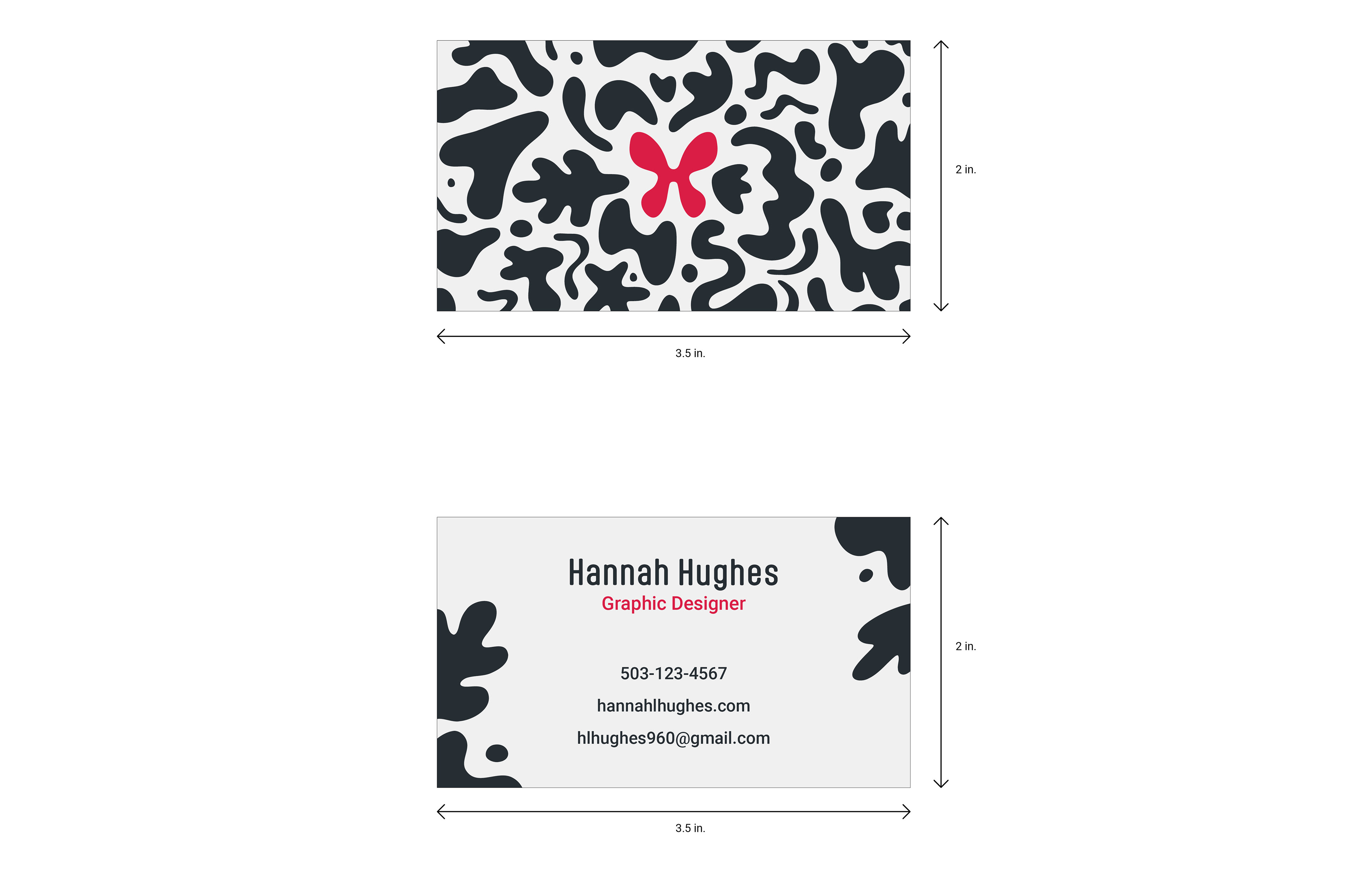
Business Cards
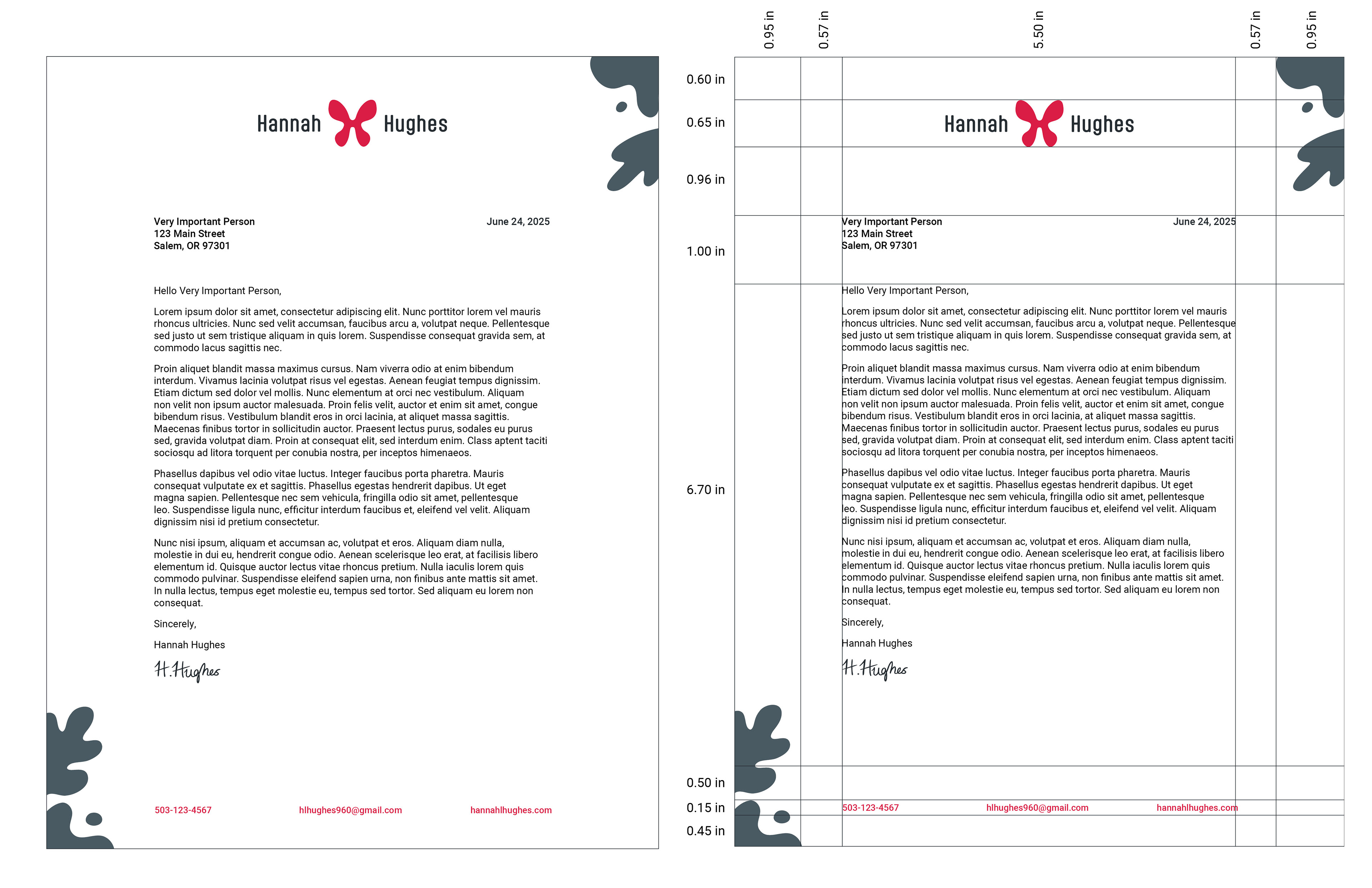
Letterhead