
Objective:
Inspired by the Modern Magic booklet, this project focuses on building a cohesive brand that provides learning materials to new witchcraft practitioners in a way that is digestible, educational, and interactive. To make this project successful, I was tasked with completing a series of independent research, using that research to define the brand, and creating the materials.
Methods:
Independent Research: Competitor Audits, Photo Ethnography, Interviews, Survey
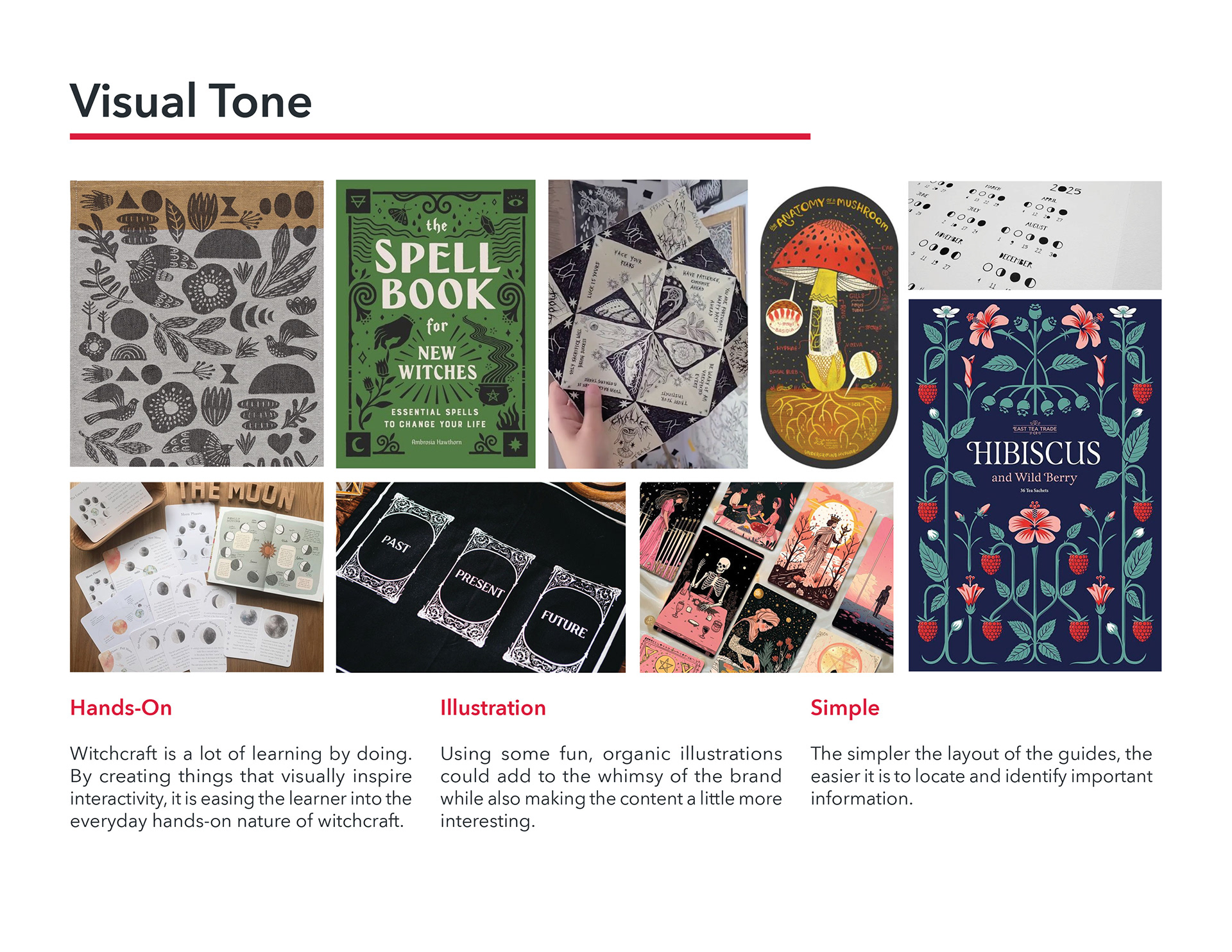
Visual & Copy Tone Boards
Sketches
Prototypes
Implementation: Packaging, Print Design, Product Photography
Phase One: Research
Competitor Audit:
Before I could start ideating what these materials could look like or what people really need, I needed to identify what was already available to them and what the current market looked like. Here are pages from my process document that highlight the current materials on the market and three competitors that are pushing in the right direction:

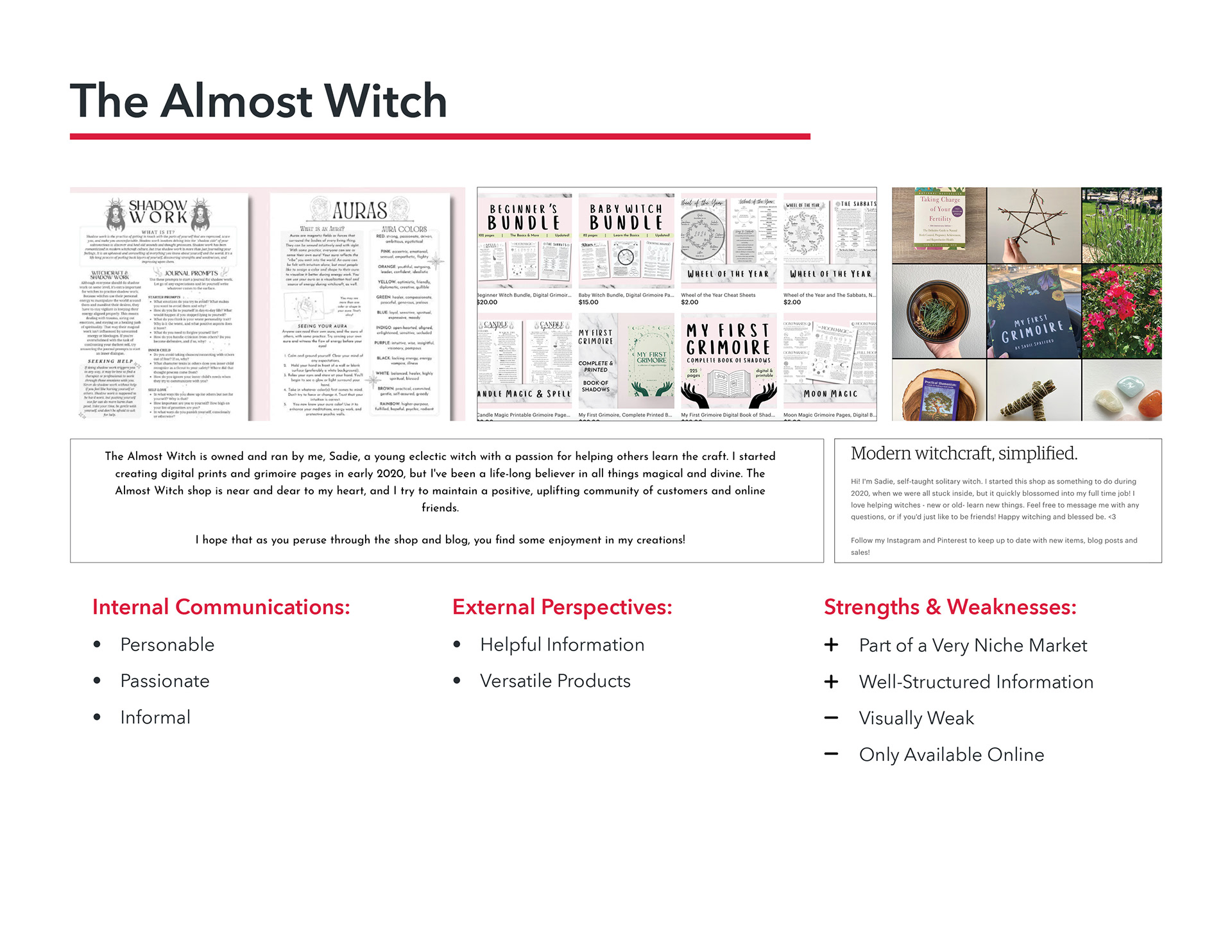
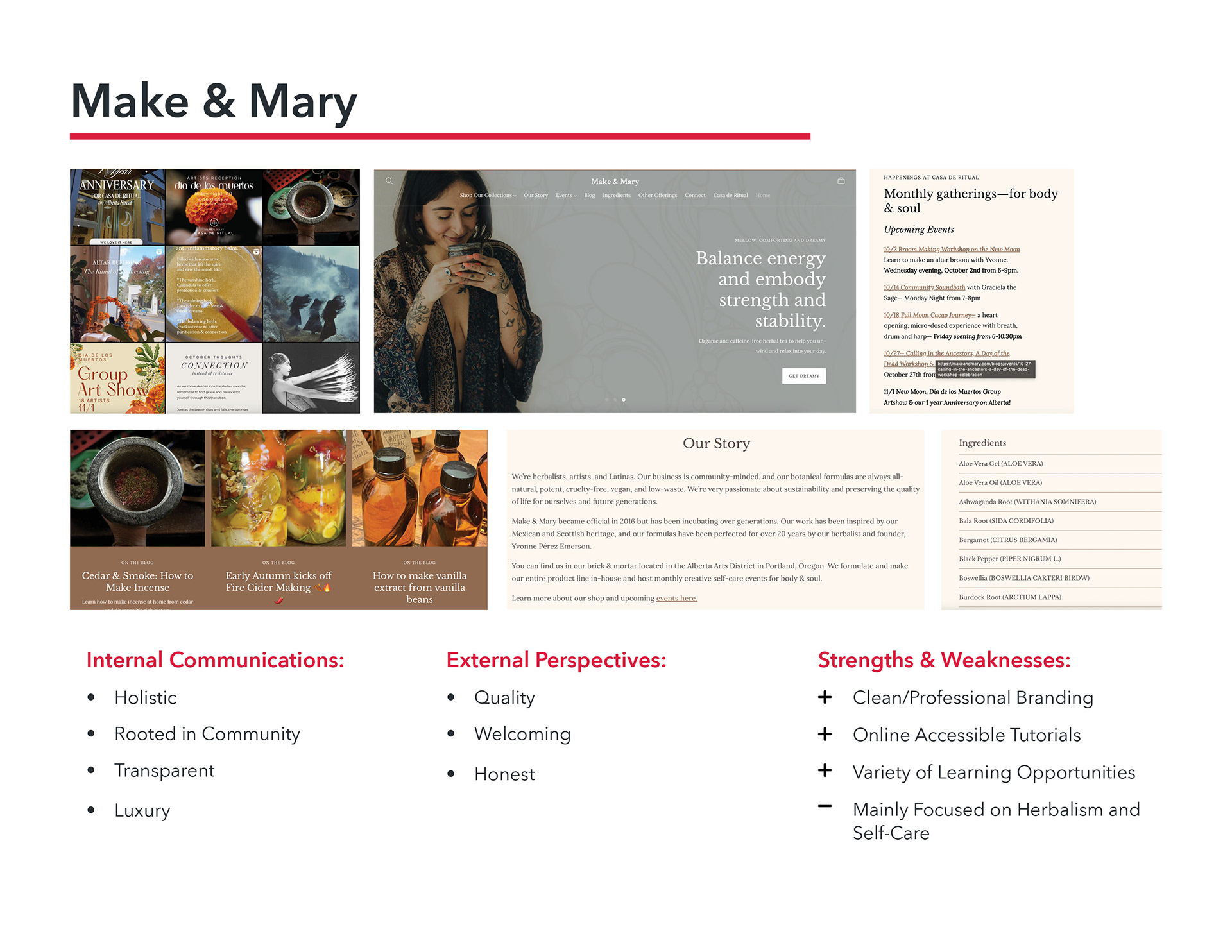

Photo Ethnography:
To fully understand what it was like to shop as someone interested in witchcraft, I went out to several different shops that sold witchy goods and took photos to document the experience. I payed special attention to things that specifically aim to teach practices at a beginner level.

Interviews:
Then it was time to talk to some actual practitioners about their experiences surrounding witchcraft and what learning was like for them. I made sure to talk to a beginner witch, an intermediate learner, and someone who has made witchcraft their profession so that I had all stages of learning covered. Here are the highlights pulled from those interviews:

Surveys:
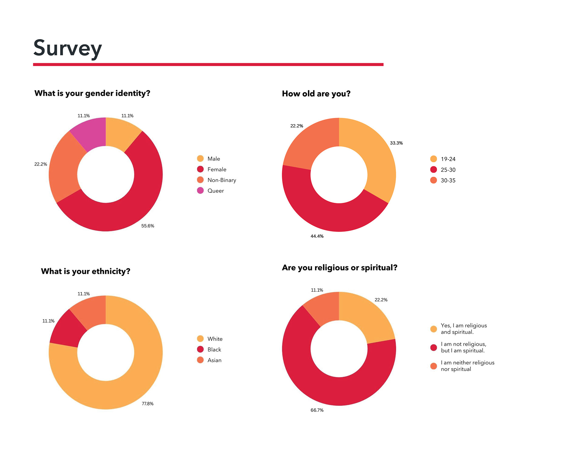
For my last set of hard research, I needed some statistics to define my target demographics and narrow down my areas of focus. In the US, religious affiliation data is not collected by the government and instead collected by private, religious organizations. This makes sourcing data on this subject really hard to find, so I made my own survey and sent it out to the public. Here are the results:

A Starting Point:
That was a lot of information, but it led me to a more solid direction. I now had my differentiators defined based on the pain points I found, my target demographic identified, and a visual/copy tone direction to move toward.


Phase Two: Development
Logo Development:
Throughout the research process, I was filled with all sorts of ideas for imagery and brand elements. I knew I wanted to do something illustrations based, and I landed on a flat, hand drawn style inspired by relief printmaking. With this style in mind I began to develop the logo through pencil sketches and digital iterations before landing on the final logo.

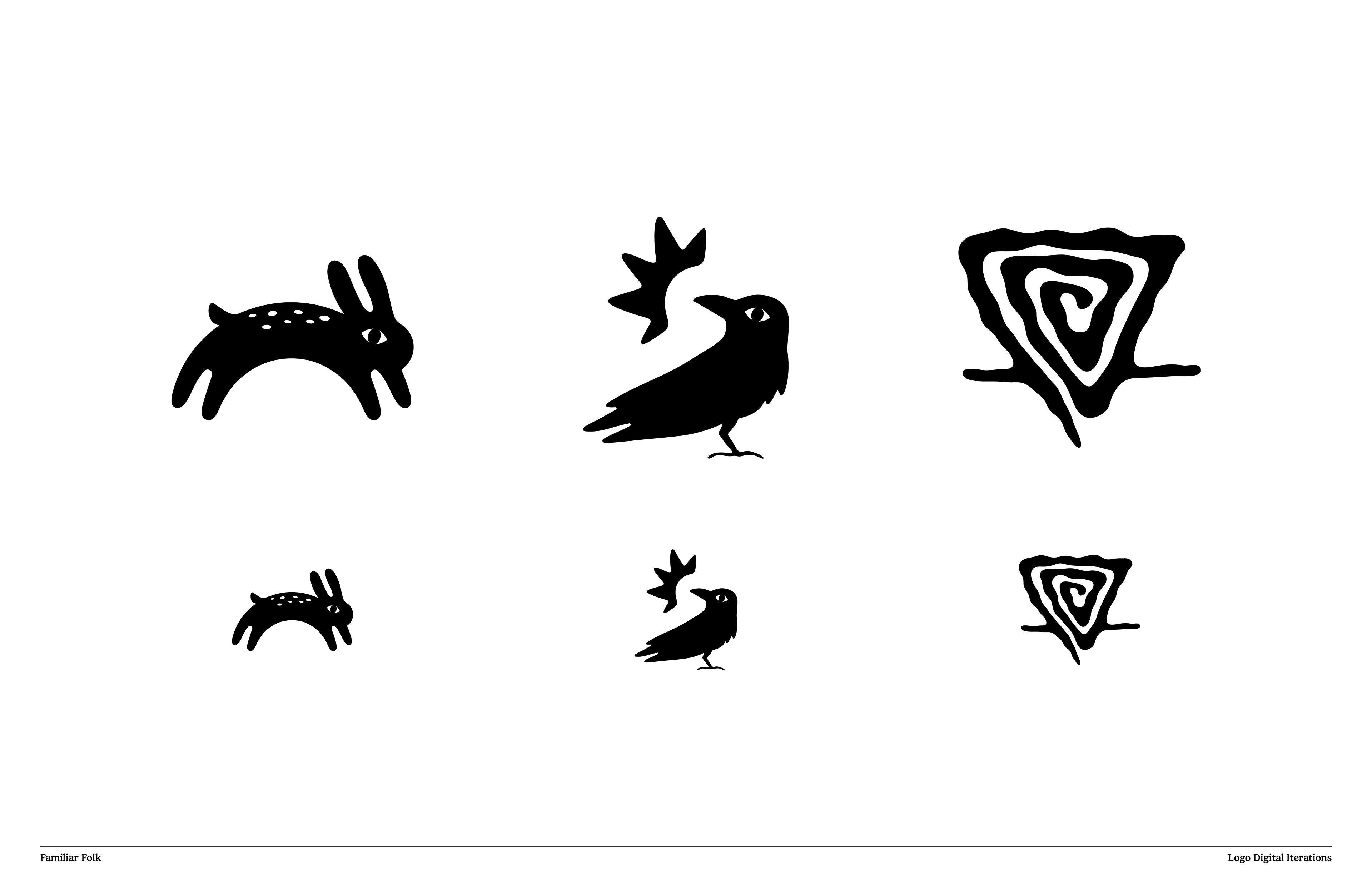
Illustration Development:
All illustrations started as hand drawn sketches that were then redrawn cleanly and finalized in Adobe Illustrator. As many designers tend to do, my working files start out as a jumble of everything as I worked through each illustration, but the final file is much more organized to make for easy and fast design work.

During the editing process.

Finalized illustrations organized by category/product.
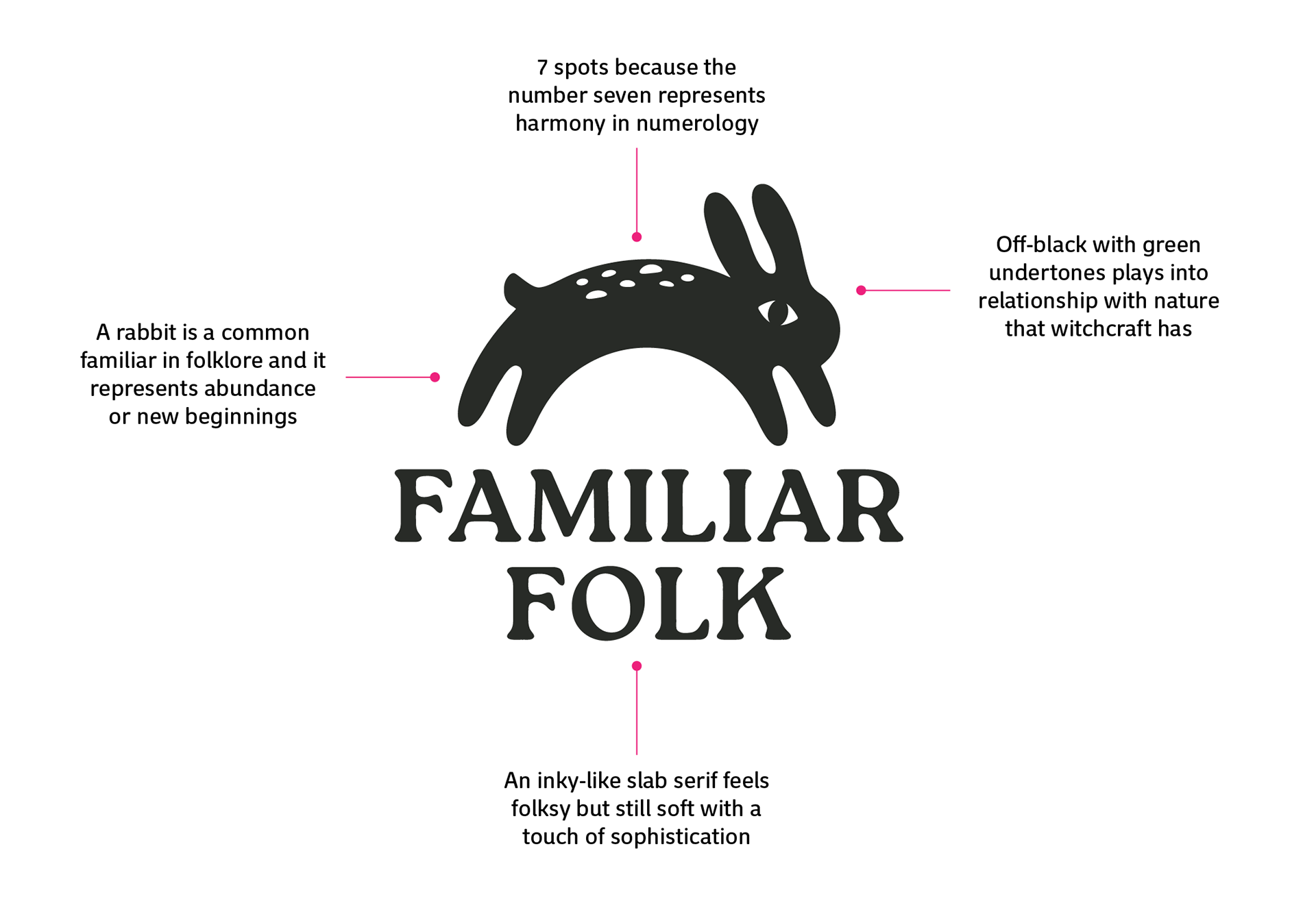
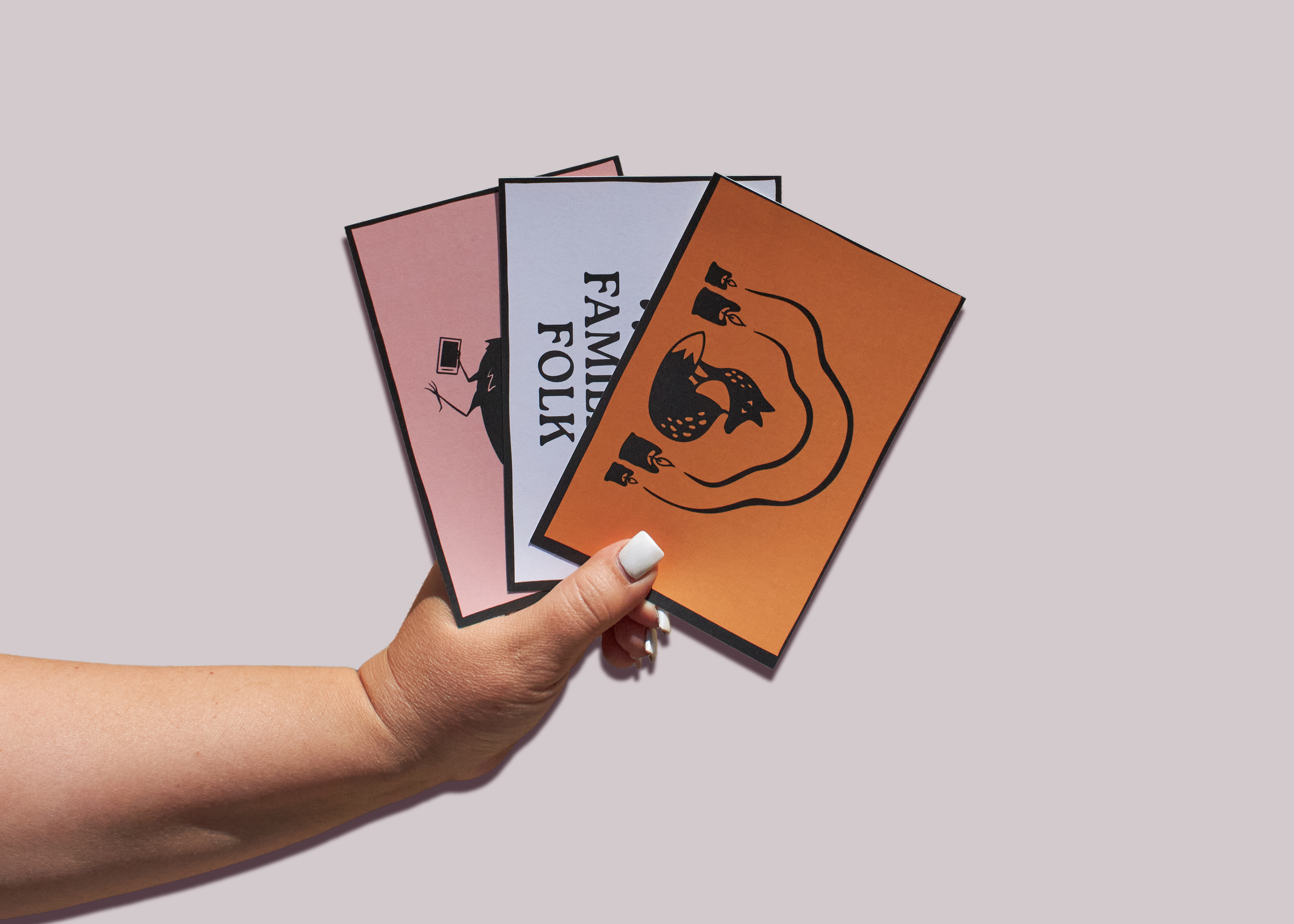
Final Logo + Branding Summary:
The final logo uses the rabbit logomark paired with a modified version of the typeface Roca. They compliment each other in a way that adds a rustic-modern whimsy feeling to the brand's logo. The unmodified version of Roca acts as the display and header type while its easier-to-read counterpart Oso Sans acts as the body and subheader type. Familiar Folk's color palette consists of an off-black with green undertones that ties in its connection to the earth and a natural muslin off-white to add a softness to the materials. The other colors in the palette are lighter shades of the rainbow used as solid backgrounds for the materials so that the artwork can shine. The illustration style is imperfect and bold to emphasize the hands-on nature of witchcraft and keep the brand fun.


Prototypes:
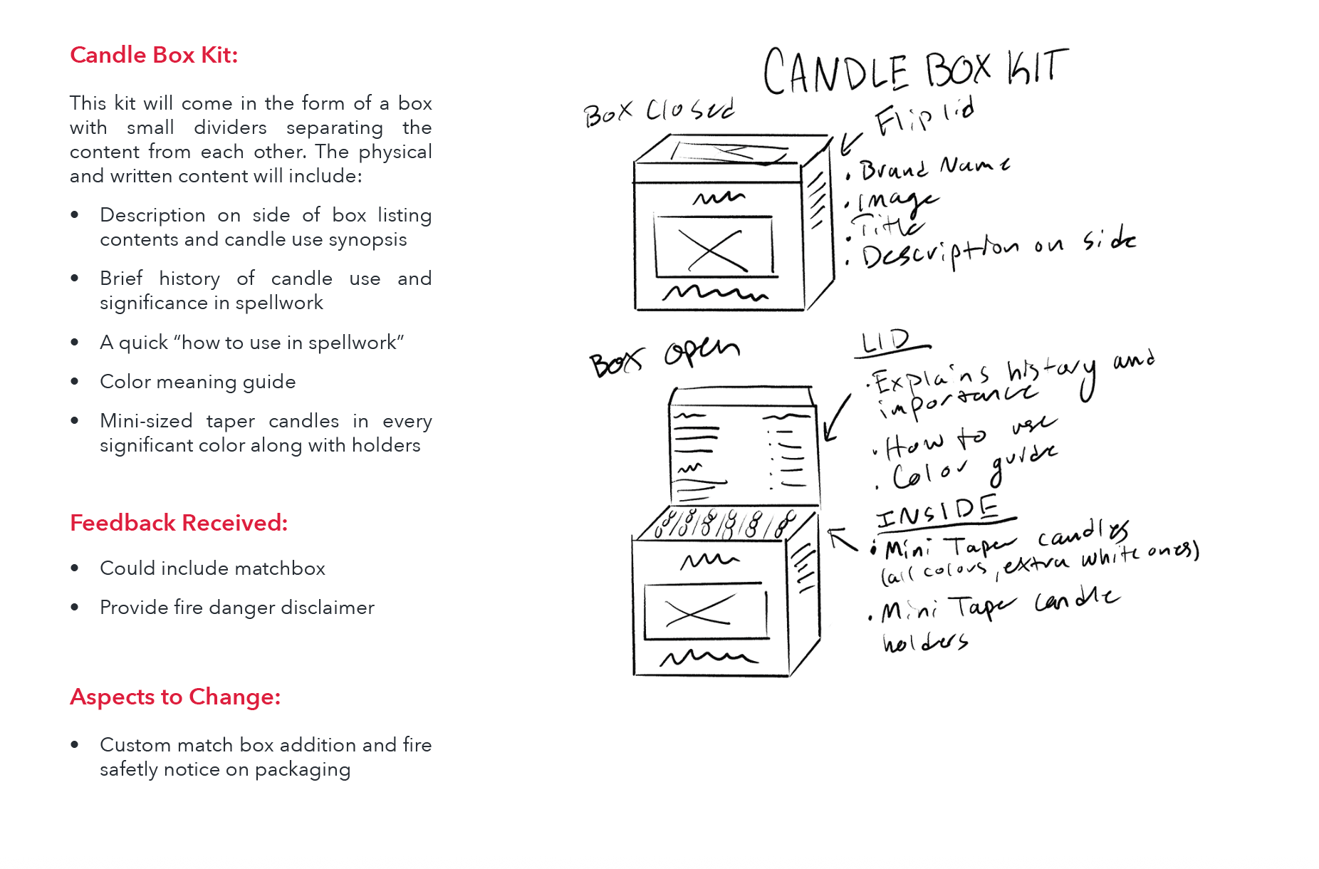
In my survey, I narrowed down the most talked about practices to be: Candle Magic, Crystal Magic, Plant Magic, and Tarot. Focusing on those topics, I sketched and made prototypes for each learning material outlining what form it could take and what content it would cover. Each prototype was shown to a small focus group that gave me feedback that allowed me to strengthen the designs and content.


Phase Three: Implementation
The Solution:
Familiar Folk is a brand grounded in the belief that learning about spiritual practices should be simple, interactive, and fun. In a community that values handicraft and art, the branding is made up of dark hand-drawn illustrations paired with bright colors for contrast. Emphasizing learning at its core, Familiar Folk's materials cover all the important stuff in a concise, digestible way to keep new witches interested and invested. By encouraging interaction with moving parts and spells to try out, Familiar Folk preps every beginner for the hands-on nature of witchcraft as a spiritual practice. These materials only cover four main areas of the practice as a starting point while leaving ample room for continuation.
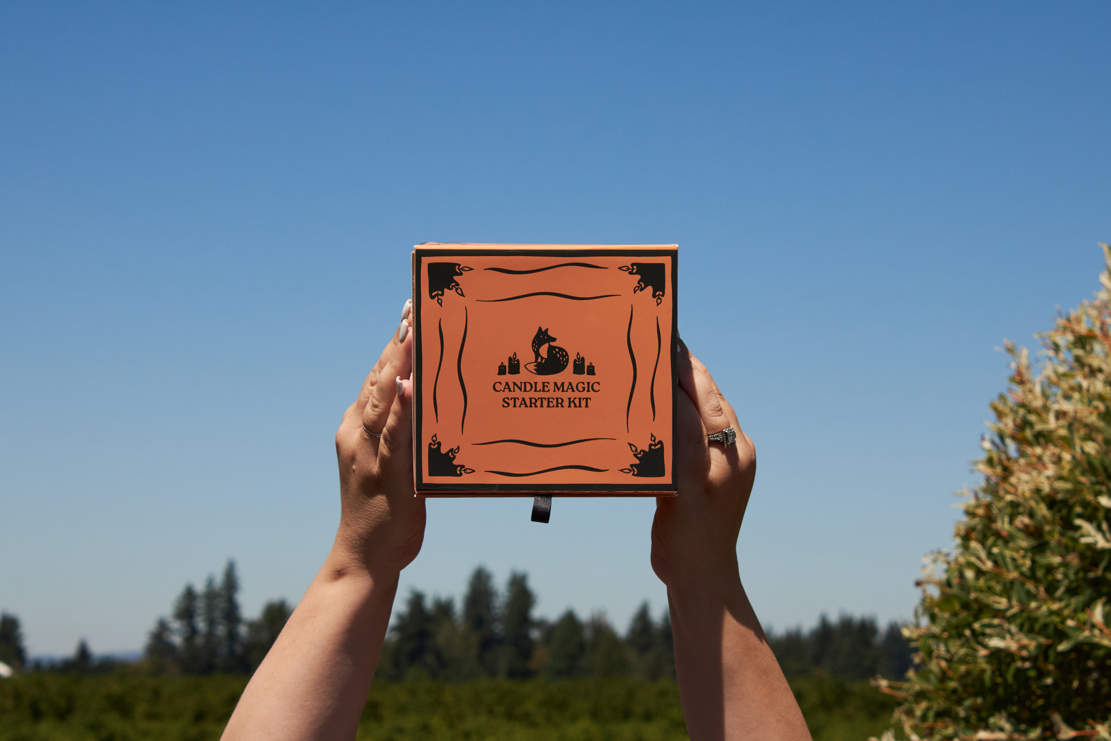
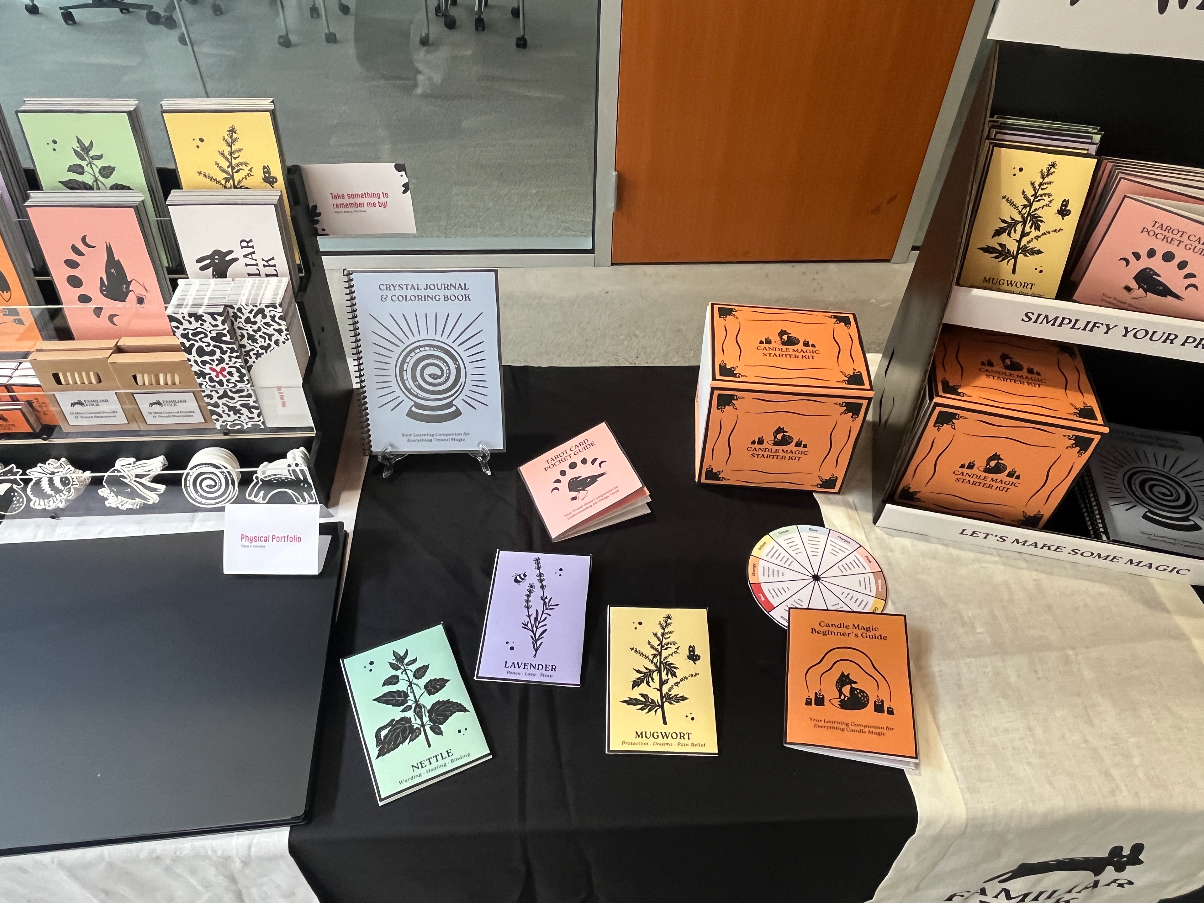
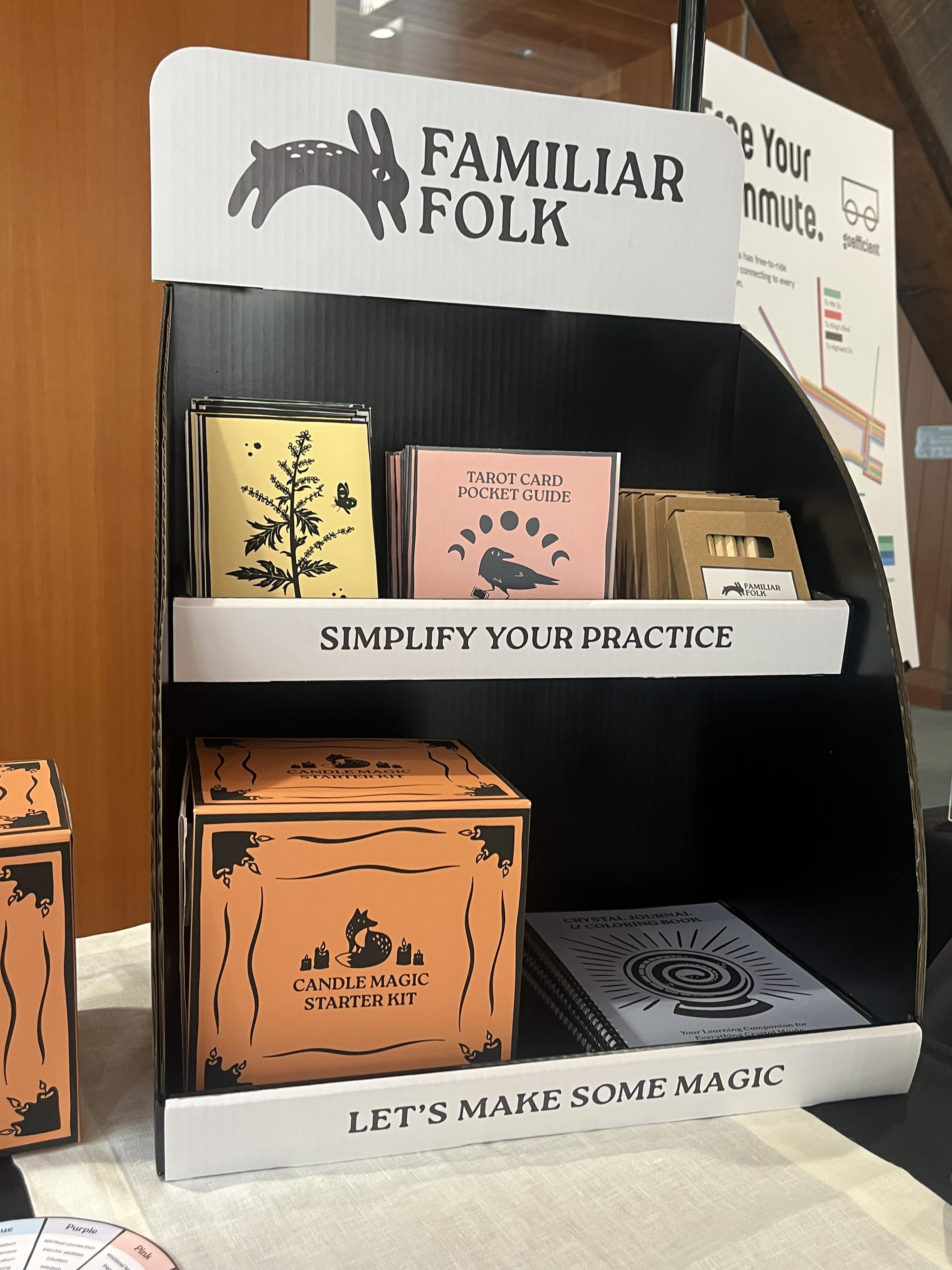
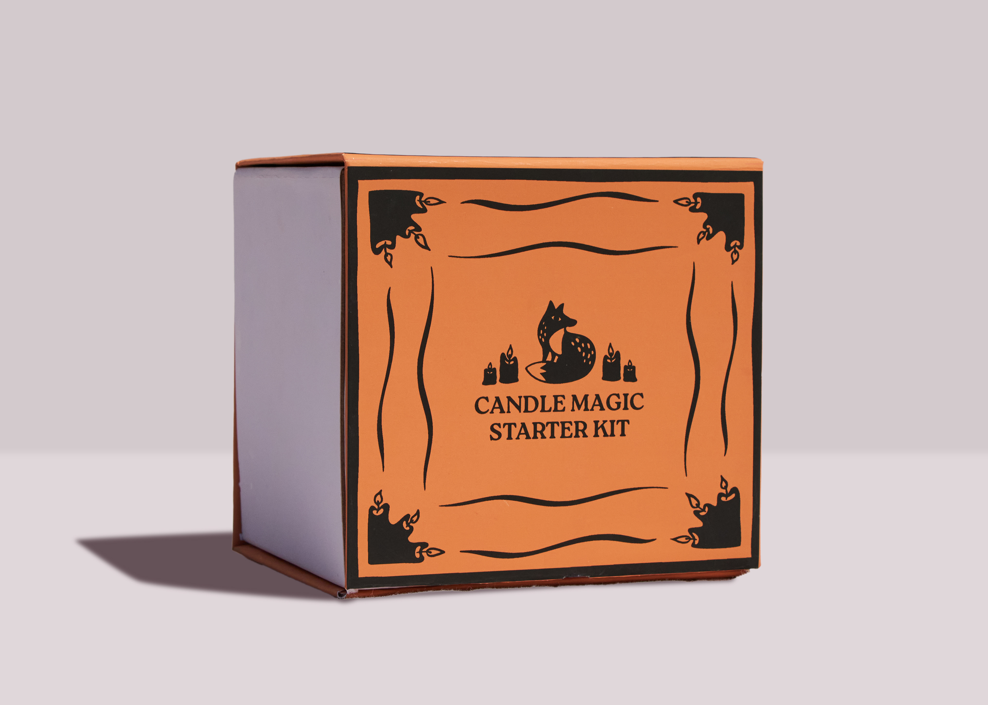
Candle Magic Starter Kit:
Familiar Folk's Candle Magic Starter Kit comes with every significant candle color, mini candle holders, a guidebook, matches, and a spinning color correspondence wheel all neatly packaged in a magnetic-close box. The hand-stitched bound guidebook contains a brief history of candle magic, how it works, instructions on how to dress candles and read flames, as well as an easy beginner level spell. The color correspondence wheel covers the spiritual meaning of each candle color included in the kit.


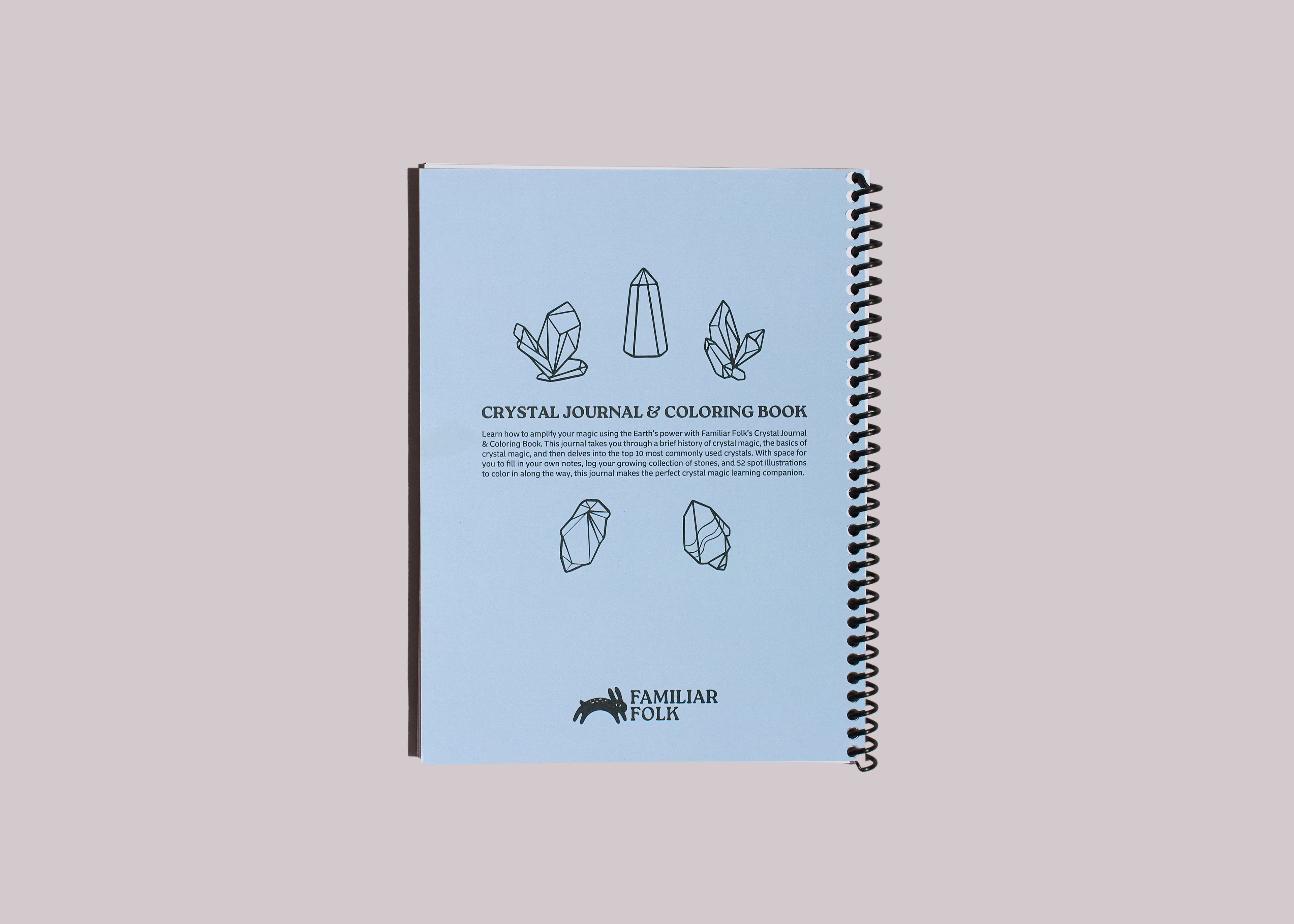
Crystal Journal & Coloring Book:
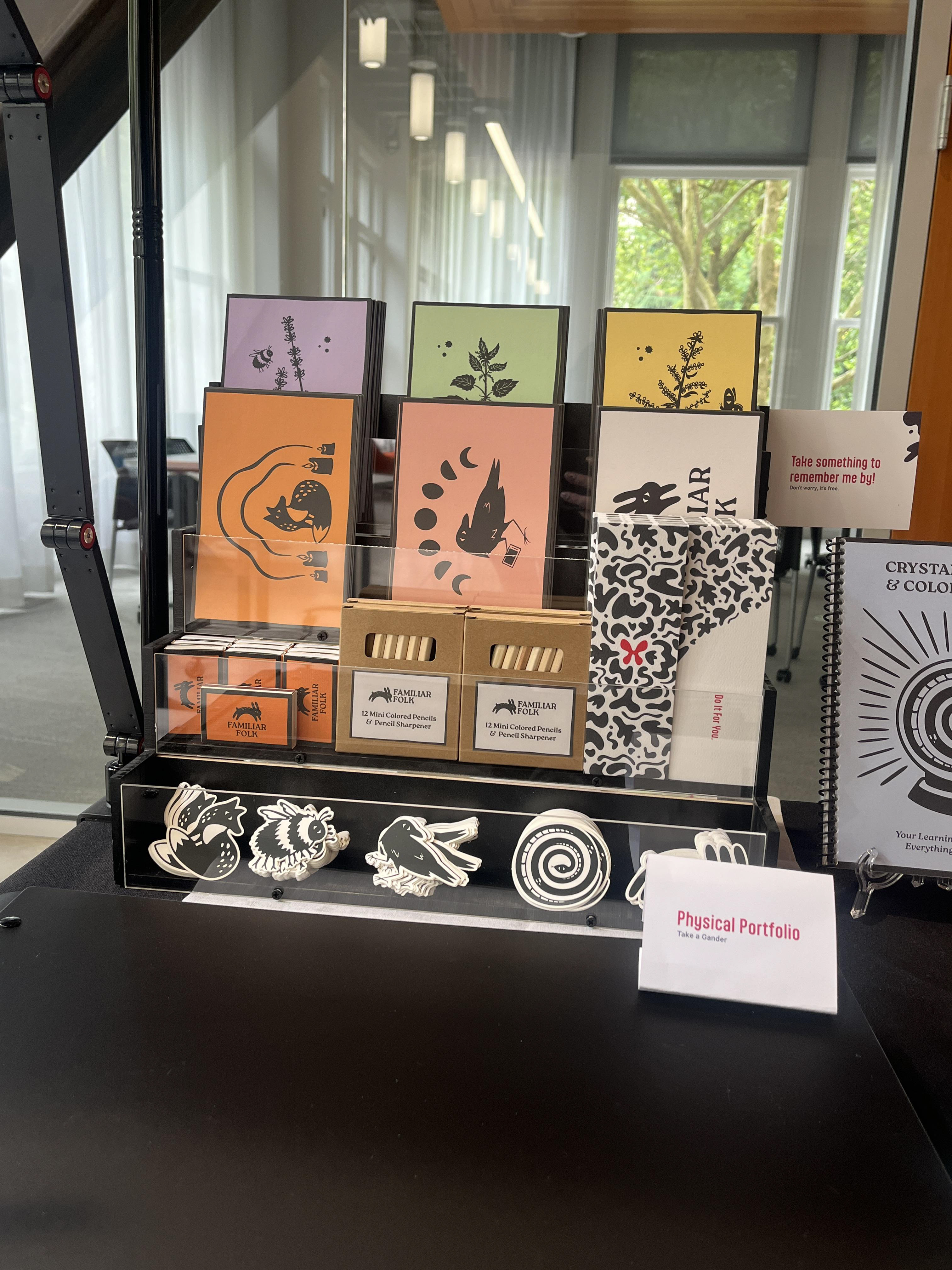
The Crystal Journal & Coloring Book is a 6x8in. spiral bound containing 60 pages and 52 spot illustrations to color in along the way. The first section of the book covers the history of crystal magic, modern uses, what the different colors and shapes of crystals mean, instructions on how to cleanse crystals, and information about crystal divination with a pendulum dowsing chart. The second section is a beginner's book of shadows journal covering the 10 most commonly used crystals and leaving blank areas for users to fill in for their own growing stone collection. Familiar Folk also offers mini colored pencils for witches on the go.


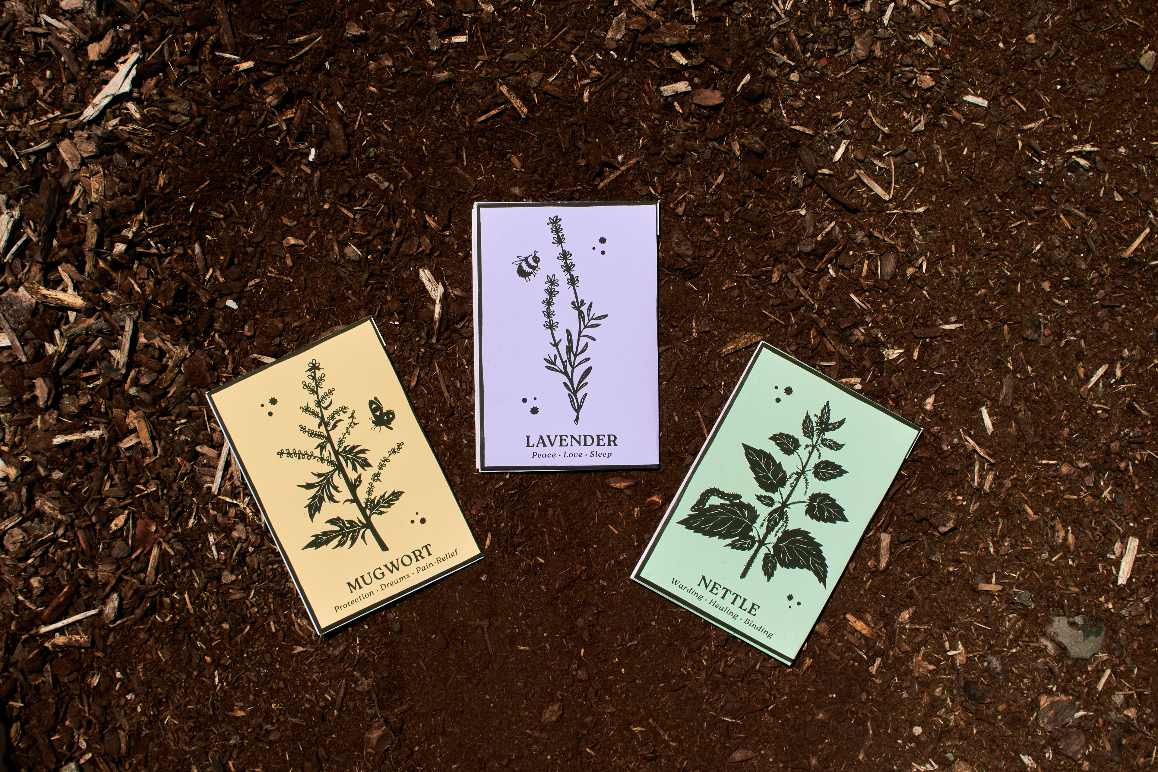
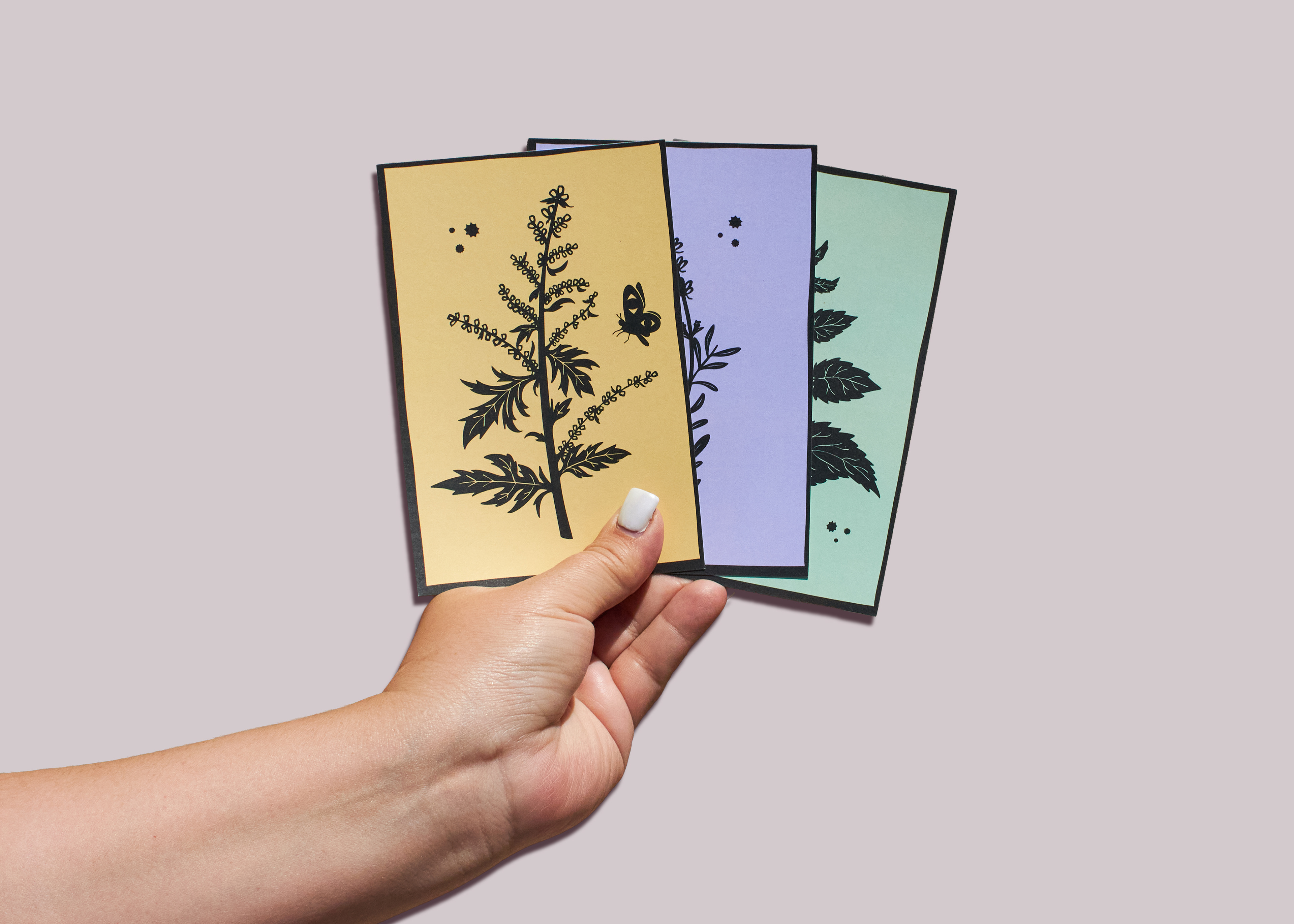
Informational Seed Packs:
Familiar Folk's seed packets contain much more than seeds to sow and plant care information. With plant illustrations paired with the uses listed on the front and bold individual colors, each pack is easily identified from the other. The back gives a brief description of what the plant is used for and the plant care information. Once opened, the seed pack has a flap that folds down that describes the uses in history, modern uses, and a beginner-level spell all while leaving the pouch in tact for easy seed storage.


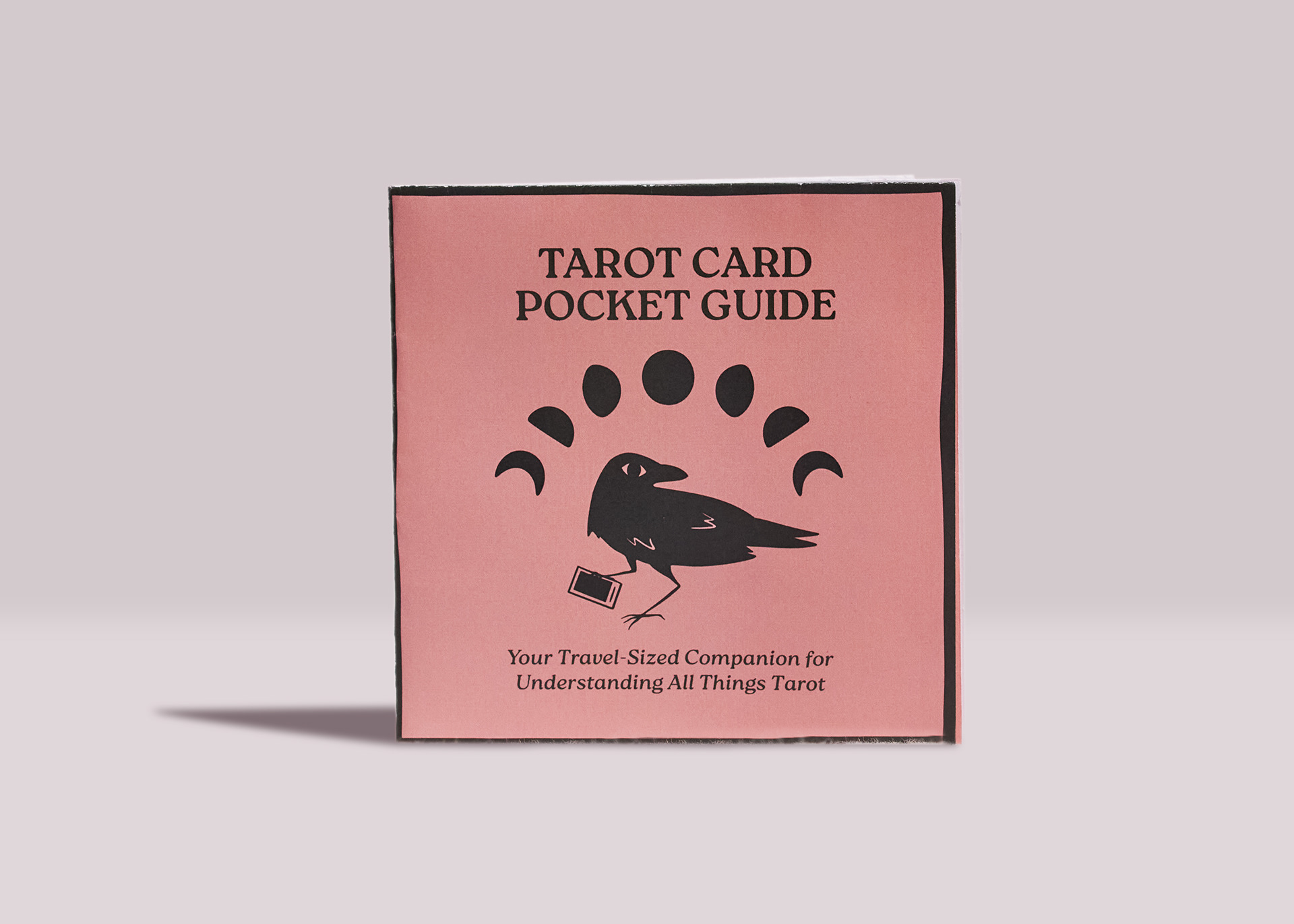
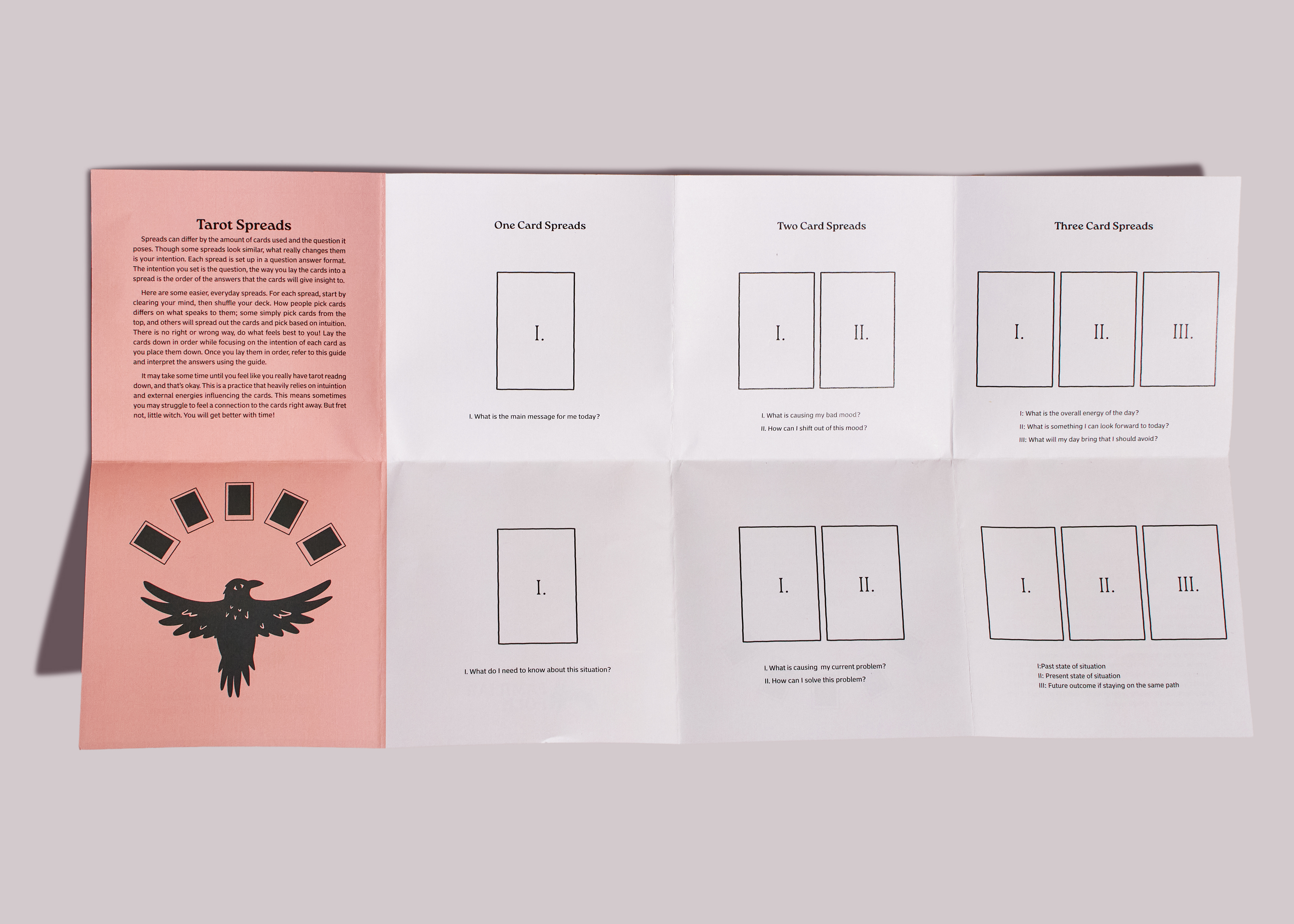
Tarot Card Pocket Guide:
The Tarot Card Pocket Guide is a 9x18in. sheet that z-folds into a convenient 4.5in. for easy travel. A common issue with learning how to tarot read is having to flip through pages upon pages of meanings per card, so Familiar Folk simplified the information by creating a chart for both the Major and Minor Arcana cards. The guide also gives a brief history of Tarot origins, advice on how to choose a deck, and the back covers some basic card spreads while explaining how they work.


Product Display:
One of the biggest issues found during the shopping ethnography was the lack of organization or grouping of products. To ensure all of Familiar Folk's products stay friends within a store, I designed a product display to house each material comfortably together.


Extras:
With illustrative branding as fun as Familiar Folk's, some little extras to giveaway were essential. These stickers feature five of the familiars on matte vinyl while the postcards showcase the familiars on recycled cardstock.


OSU GD Senior Showcase Display:
Familiar Folk was my senior capstone project to wrap up my BFA at Oregon State University. Here is all my materials and my booth at the event.