Objective:
Boma Jewelry, a B Corporation that manufactures fine sterling silver and gold-plated jewelry, has shifted their gaze to Gen Z women as their target audience. To better reach their desired audience, they needed an updated visual identity.
Methods:
Mind-map
Moodboards
Pencil and Digital Sketches
Implementation: Print and Mockups
Phase One: Ideation
Mind-Map & Moodboard:
Idea generation starts with a mind-map where concepts regarding the brand and their beliefs are expanded into imagery and visual concepts. From the mindmap, two moodboards are created to offer two possible visual directions.
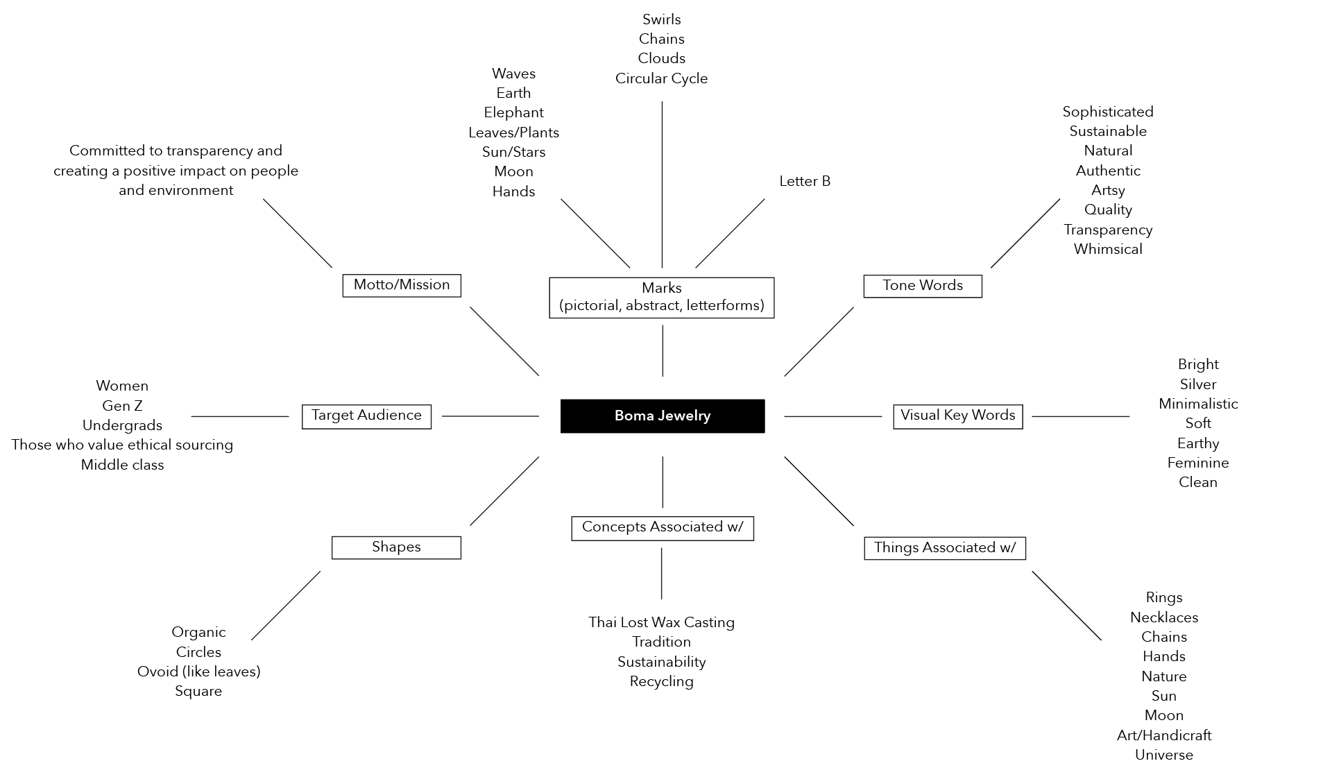
Mind-map
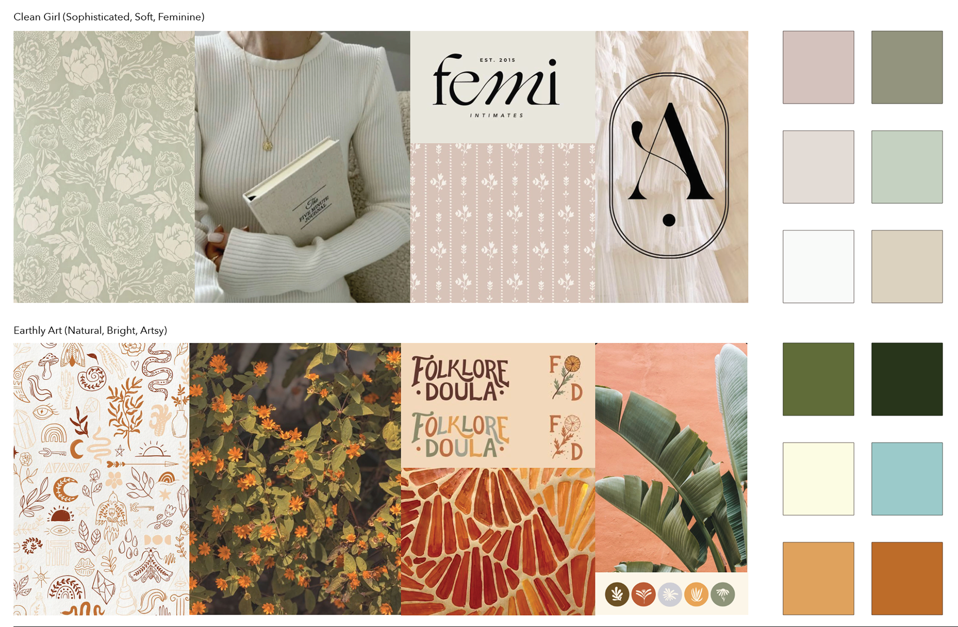
Moodboards
Phase Two: Development
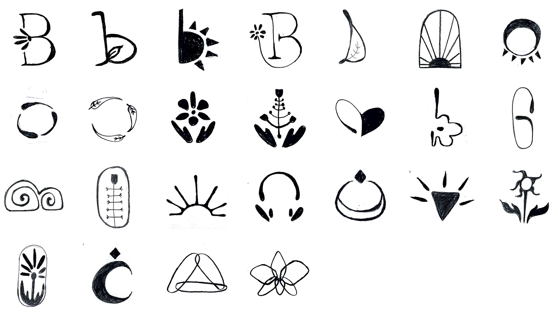
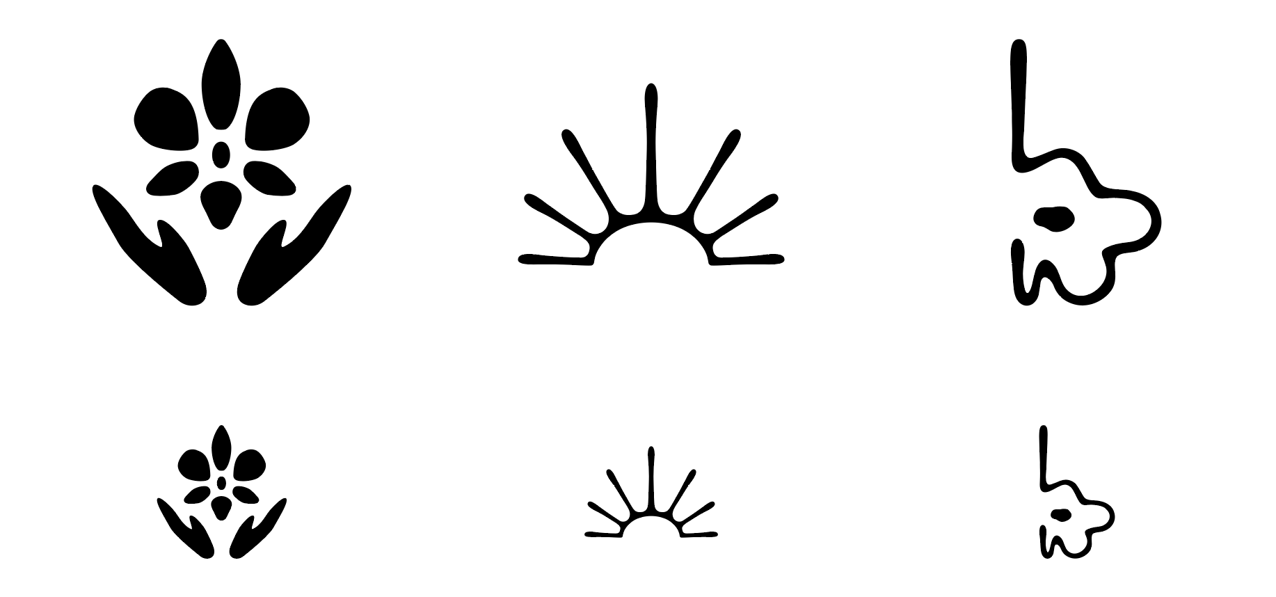
Pencil & Digital Sketches:
Combining the ideas from the mind-map and the visual tones in the moodboards, 20 pencil sketches for potential logos were generated. From these sketches, three were chosen to be moved into digital iterations. From here the final logo mark was chosen, further pushed in its design, and paired with type.
Pencil Sketches
Digital Sketches
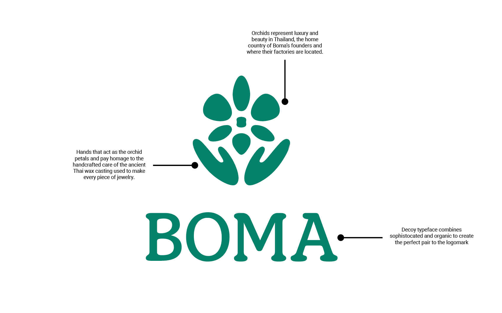
Final Logomark
Phase Three: Implementation
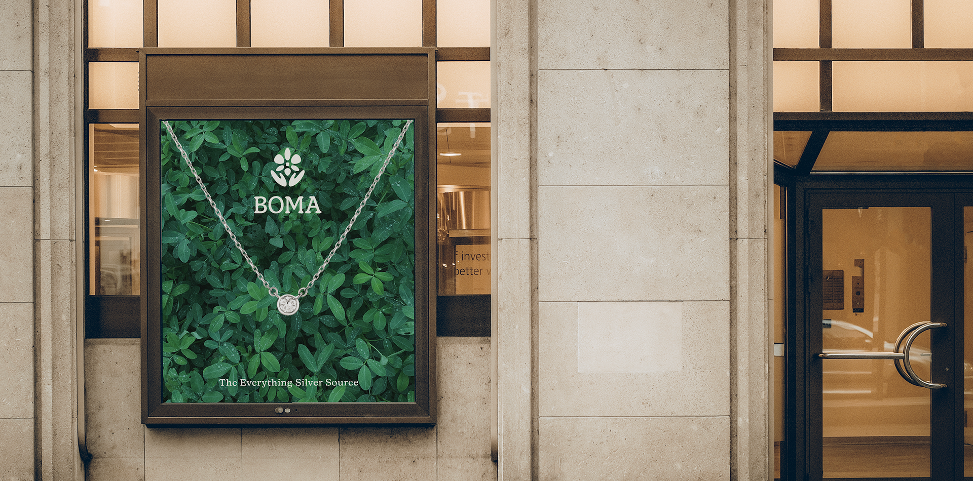
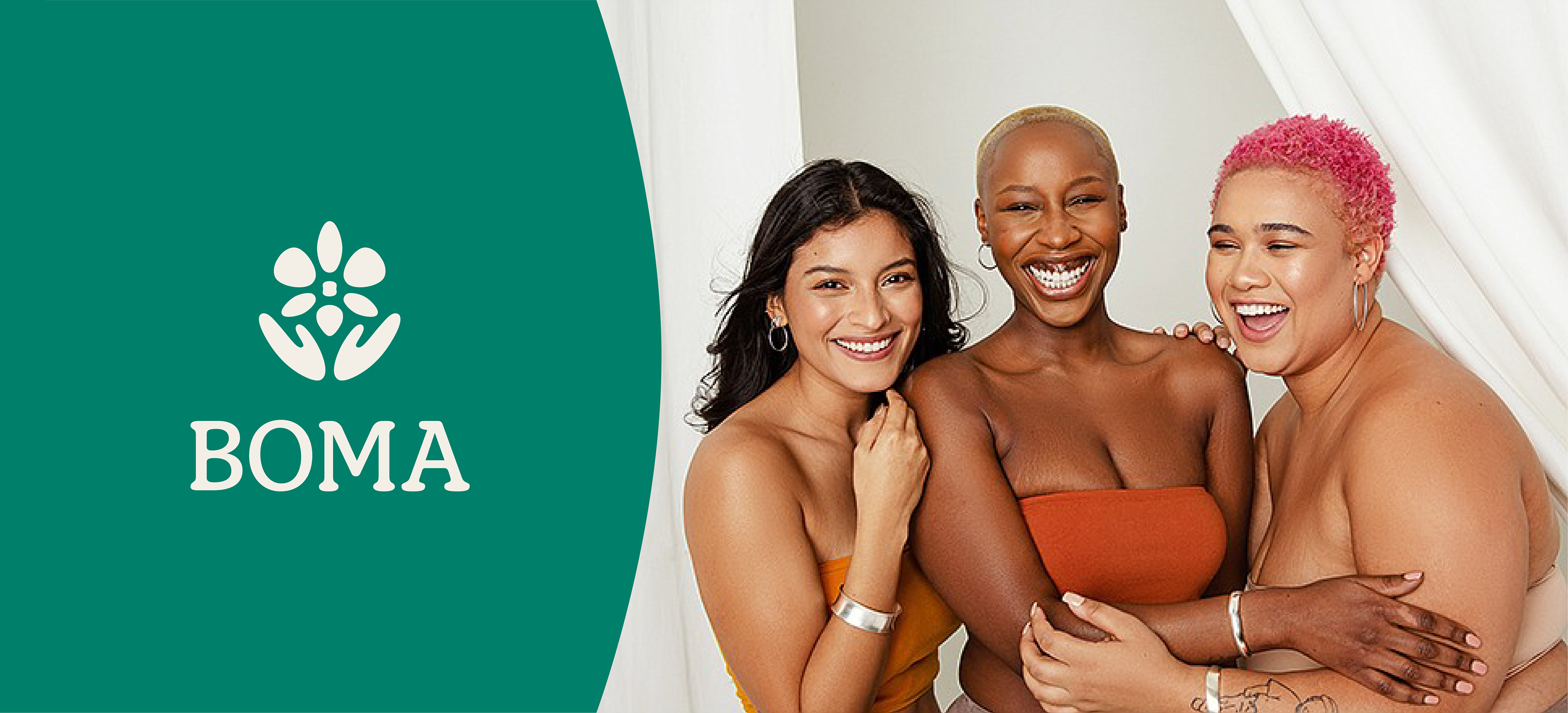
The Brand:
Really focusing on the handicraft and dedication to sustainable practices, the new brand focuses on the art and ties to nature in every piece of Boma jewelry. Keeping the color palette soft and bright makes it more inviting, while keeping the palette simple leans into the luxury of fine jewelry. With nature in mind, the logo and imagery used in ads nods toward the impact Boma has on the planet due to their ethical sourcing. The deliverables for this new identity system included a new logo, typefaces, colors, stationary, and packaging.

New Logo, Color Palette, and Type

Shopping Bag
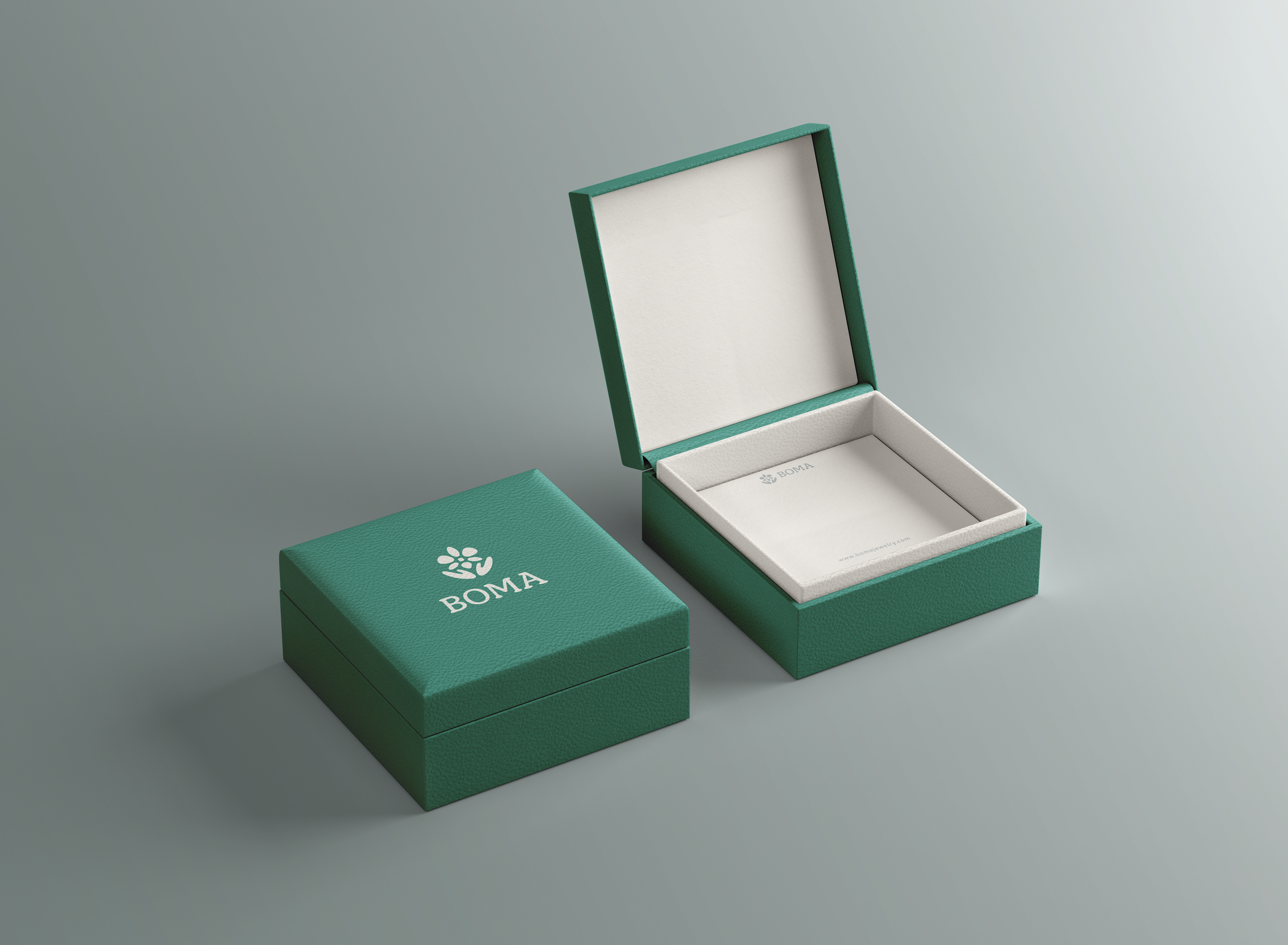
Jewelry Box
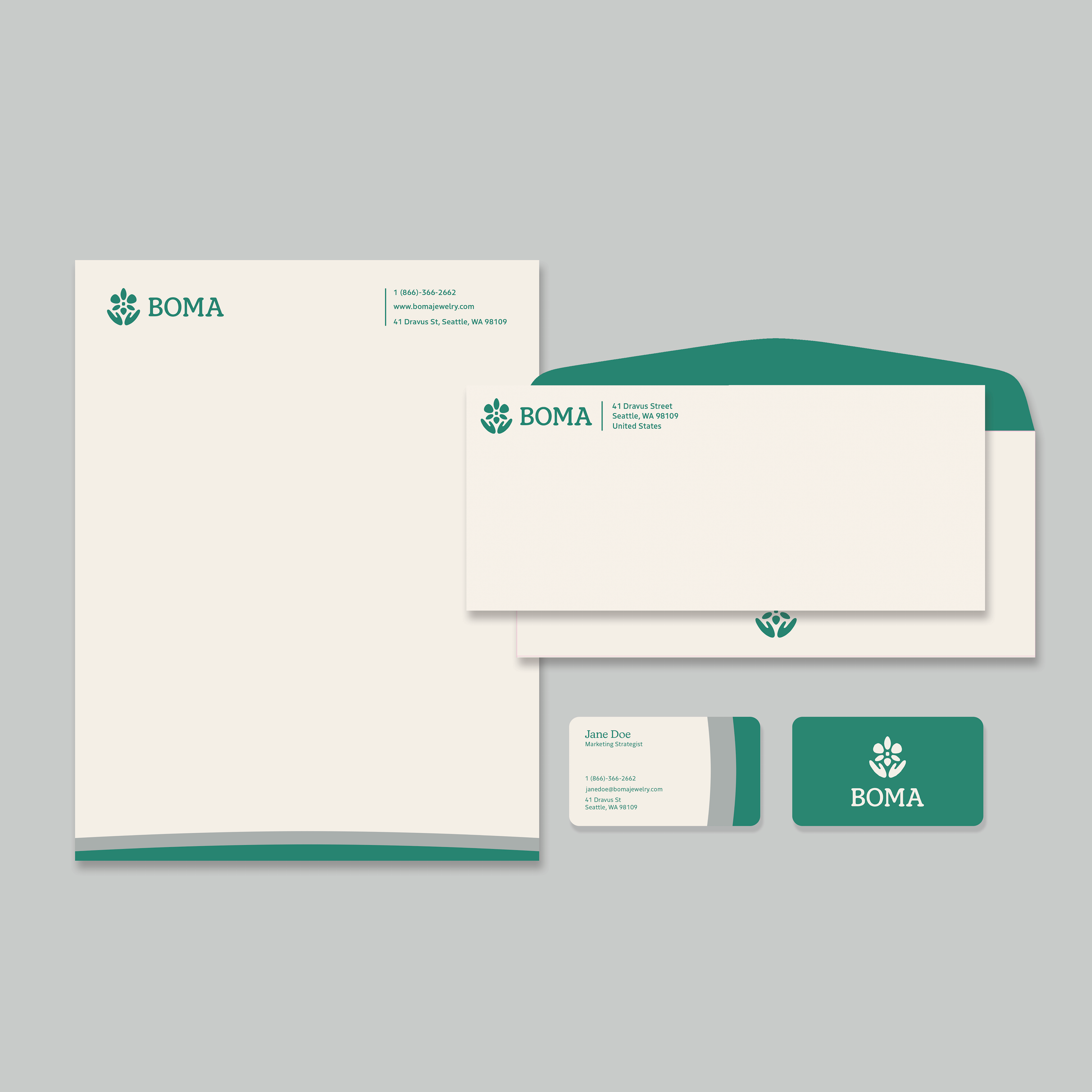
Stationary Set